install.packages(c("babynames", "nycflights13"))
install.packages(c("dplyr", "tidyr"))There are alot of interesting datasets out there that we could make plots with, but not without some pre-processing.
── Attaching packages ─────────────────────────────────────── tidyverse 1.3.2 ──
✔ tibble  3.1.8     ✔ dplyr   1.1.0
✔ tidyr   1.2.1     ✔ stringr 1.5.0
✔ readr   2.1.3     ✔ forcats 0.5.2
✔ purrr   0.3.5
── Conflicts ────────────────────────────────────────── tidyverse_conflicts() ──
✖ dplyr::filter() masks stats::filter()
✖ dplyr::lag() masks stats::lag()babynames
The babynames package does one thing: gives you a dataframe of the number of babies born each year given a specific name.
babynames |>
  sample_n(50) |>
  arrange(year, n) |>
  rmarkdown::paged_table()
Issue: How do we make a legible plot of just a few names?
Class plan
Side note:
The linguistic study of names is called Onomastics.
What we did
This is a dataframe of how may babies were given a specific name between 1880 and 2017 in the US for every name that had at least 5 babies. It has almost 2 million rows.
babynames# A tibble: 1,924,665 × 5
year sex name n prop
<dbl> <chr> <chr> <int> <dbl>
1 1880 F Mary 7065 0.0724
2 1880 F Anna 2604 0.0267
3 1880 F Emma 2003 0.0205
4 1880 F Elizabeth 1939 0.0199
5 1880 F Minnie 1746 0.0179
6 1880 F Margaret 1578 0.0162
7 1880 F Ida 1472 0.0151
8 1880 F Alice 1414 0.0145
9 1880 F Bertha 1320 0.0135
10 1880 F Sarah 1288 0.0132
# … with 1,924,655 more rowsHard to visualize just as it is. To make a plot of individual names, we need to subset, or filter the data so that we get just the rows for a single name.
filter
The dplyr::filter() function. Tell it the data frame you want to filter, and how you want to filter it. Here, we’re saying “just the rows where the column name is equal to "Jennifer". We get back just 165 rows out of the original 2 million.
filter(babynames, name == "Jennifer")# A tibble: 165 × 5
year sex name n prop
<dbl> <chr> <chr> <int> <dbl>
1 1916 F Jennifer 5 0.00000461
2 1919 F Jennifer 6 0.00000511
3 1920 F Jennifer 7 0.00000563
4 1921 F Jennifer 5 0.00000391
5 1922 F Jennifer 7 0.00000561
6 1923 F Jennifer 9 0.00000719
7 1924 F Jennifer 11 0.00000849
8 1925 F Jennifer 9 0.00000713
9 1926 F Jennifer 10 0.00000813
10 1927 F Jennifer 5 0.00000404
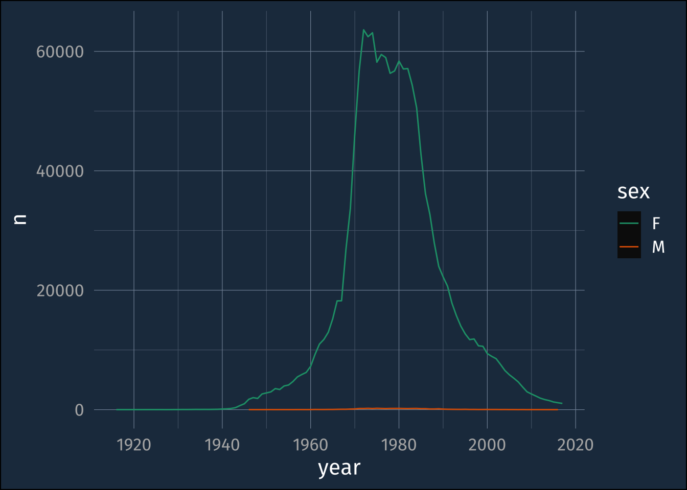
# … with 155 more rowsWe can use this filter() expression as the dataset we tell ggplot() to plot.
ggplot(filter(babynames, name == "Jennifer"),
       aes(year, n, color = sex))+
  geom_line()+
  scale_color_brewer(palette = "Dark2")
“piping”
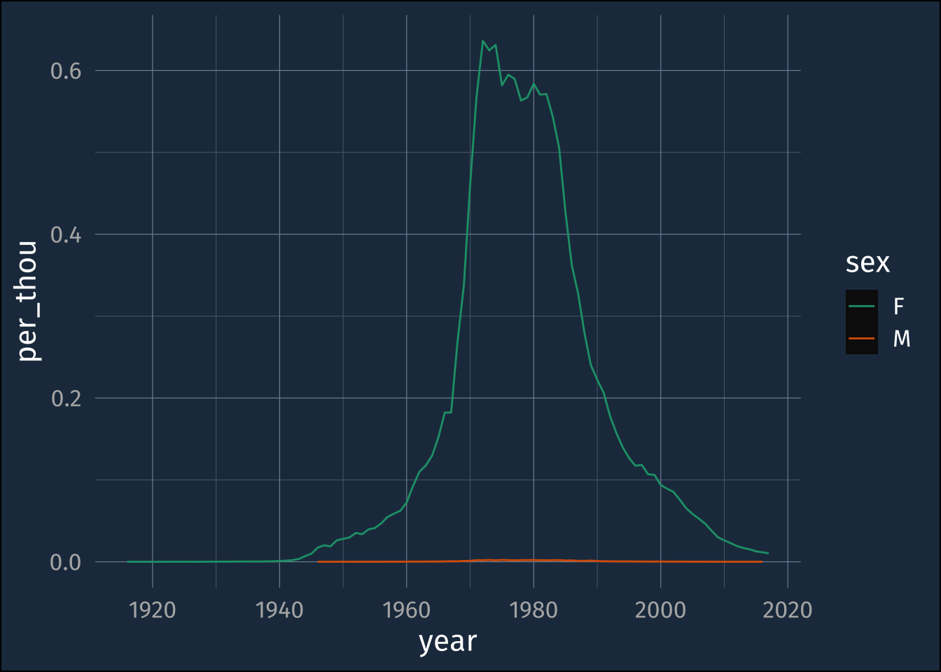
This block of code is supposed to be hard to read to illustrate a point!
ggplot(
  mutate(
    filter(
      babynames,
      name == "Jennifer"
    ),
    per_thou = n/100000
  ),
  aes(year, per_thou, color = sex)
  )+
  geom_line()+
  scale_color_brewer(palette = "Dark2")
The order of operations happening here are
- We take the
babynamesdataframe - We
filter()it to get just the rows wherenameis equal to"Jennifer" - We
mutate()it, to add a new column calledper_thouwhich is just thencolumn divided by 100,000 - We
ggplot()the resulting data
But the order that things happen is reverse from the order they appear in the code! Not ideal!
There’s a new operator
|>
## before
# filter(babynames, name == "Jennifer")

babynames |>
  filter(name == "Jennifer") |>
  mutate(per_thou = n/100000) ->
  jennifer_data

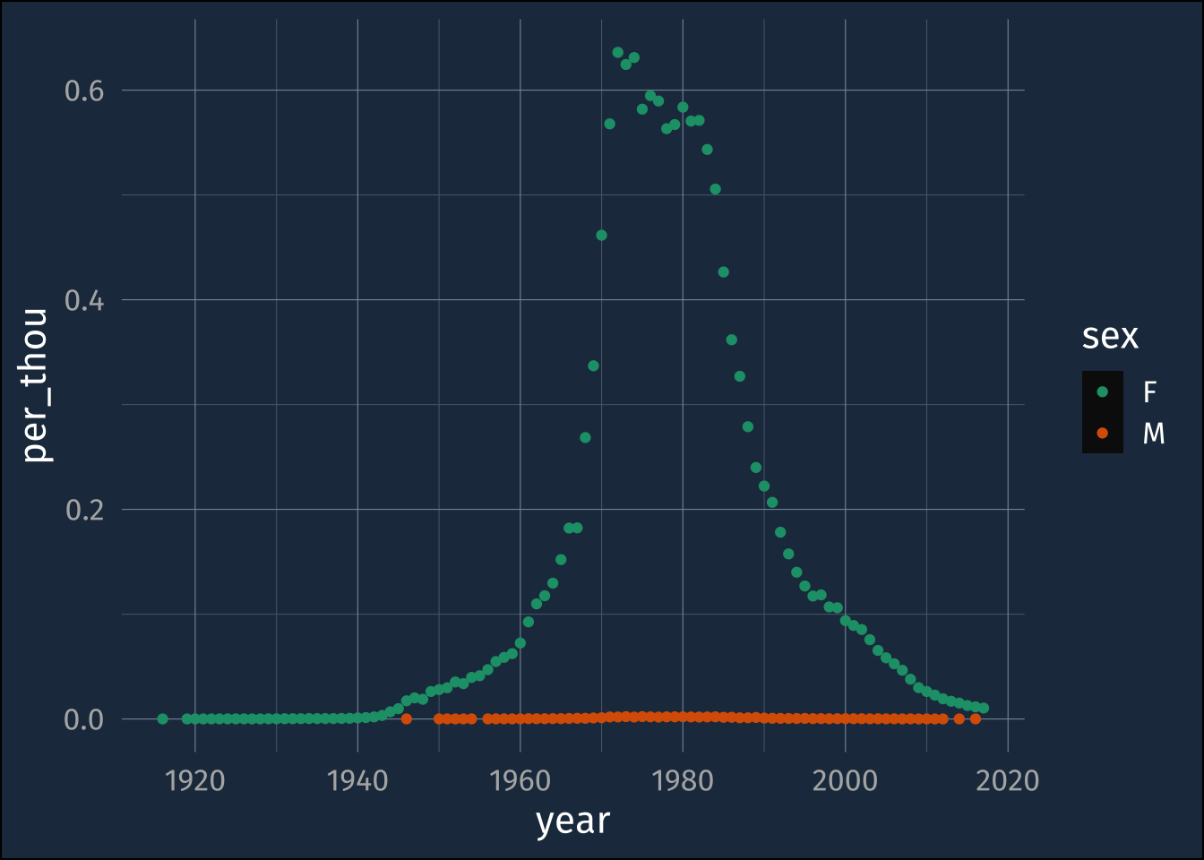
jennifer_data |>
  ggplot(aes(year, per_thou, color = sex))+
    geom_point()+
    scale_color_brewer(palette = "Dark2")
More Names things
babynames |>
  summarise(
    .by = c(year, sex),
    total_babies = sum(n),
    total_names = n()
  ) |>
  mutate(
    fake = "a",
    names_per_baby = total_names/total_babies
  )
# A tibble: 276 × 6
year sex total_babies total_names fake names_per_baby
<dbl> <chr> <int> <int> <chr> <dbl>
1 1880 F 90993 942 a 0.0104
2 1880 M 110491 1058 a 0.00958
3 1881 F 91953 938 a 0.0102
4 1881 M 100743 997 a 0.00990
5 1882 F 107847 1028 a 0.00953
6 1882 M 113686 1099 a 0.00967
7 1883 F 112319 1054 a 0.00938
8 1883 M 104627 1030 a 0.00984
9 1884 F 129020 1172 a 0.00908
10 1884 M 114442 1125 a 0.00983
# … with 266 more rows # ggplot(aes(year, total_names/total_babies, color = sex))+
# geom_line(size = 2)+
# scale_color_brewer(palette = "Dark2")+
# theme_minimal()Getting the data we want
babynames# A tibble: 1,924,665 × 5
year sex name n prop
<dbl> <chr> <chr> <int> <dbl>
1 1880 F Mary 7065 0.0724
2 1880 F Anna 2604 0.0267
3 1880 F Emma 2003 0.0205
4 1880 F Elizabeth 1939 0.0199
5 1880 F Minnie 1746 0.0179
6 1880 F Margaret 1578 0.0162
7 1880 F Ida 1472 0.0151
8 1880 F Alice 1414 0.0145
9 1880 F Bertha 1320 0.0135
10 1880 F Sarah 1288 0.0132
# … with 1,924,655 more rowsWorking with strings
[1] FALSE TRUE TRUE FALSE