Why do data visualization?
Here’s a classic example called Anscomb’s quartet.
code for making the plot
anscombe |>
  mutate(rowid = 1:n()) |>
  pivot_longer(-rowid) |>
  mutate(
    dim = str_extract(name, "[xy]"),
    series = str_extract(name, "\\d")
  ) |>
  select(-name) |>
  pivot_wider(
    names_from = dim,
    values_from = value
  ) -> anscomb_long

anscomb_long |>
  ggplot(aes(x, y)) +
    geom_point(
      aes(color = series),
      size = 3,
     ) +
    scale_color_bright(
      guide = "none"
    )+
    facet_wrap(~series, label = label_both) +
    theme(aspect.ratio = 1)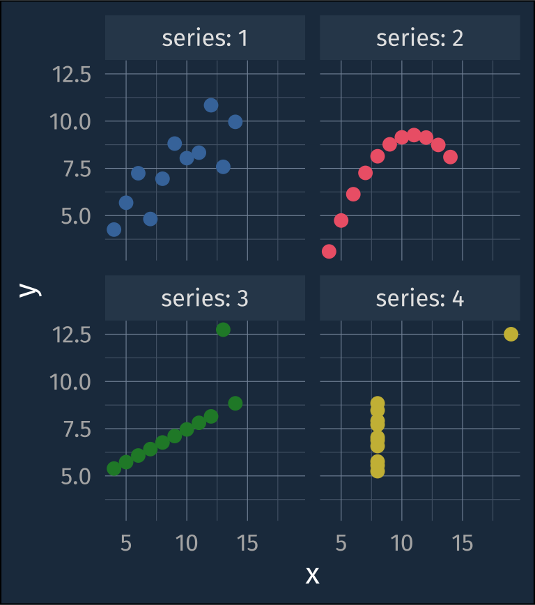
But a simple correlation test within each series results in nearly identical values.
| series | estimate | statistic | p.value | parameter | conf.low | conf.high |
|---|---|---|---|---|---|---|
| 1 | 0.816 | 4.241 | 0.002 | 9 | 0.424 | 0.951 |
| 2 | 0.816 | 4.239 | 0.002 | 9 | 0.424 | 0.951 |
| 3 | 0.816 | 4.239 | 0.002 | 9 | 0.424 | 0.951 |
| 4 | 0.817 | 4.243 | 0.002 | 9 | 0.425 | 0.951 |
The same goes for fitting linear regressions to each series.
| term | estimate | std.error | statistic | p.value |
|---|---|---|---|---|
| 1 | ||||
| (Intercept) | 3.000 | 1.125 | 2.667 | 0.026 |
| x | 0.500 | 0.118 | 4.241 | 0.002 |
| 2 | ||||
| (Intercept) | 3.001 | 1.125 | 2.667 | 0.026 |
| x | 0.500 | 0.118 | 4.239 | 0.002 |
| 3 | ||||
| (Intercept) | 3.002 | 1.124 | 2.670 | 0.026 |
| x | 0.500 | 0.118 | 4.239 | 0.002 |
| 4 | ||||
| (Intercept) | 3.002 | 1.124 | 2.671 | 0.026 |
| x | 0.500 | 0.118 | 4.243 | 0.002 |
A more recent and fun example of extremely different underlying data which have (nearly) identical parametric summaries is the “datasaurus dozen” (Matejka and Fitzmaurice 2017; Davies et al. 2022).
animation code
datasaurus_dozen |>
  mutate(dataset_n = as.numeric(as.factor(dataset))) |>
  group_by(dataset) |>
  mutate(id = 1:n()) |>
  ggplot(aes(x, y, color = dataset_n))+
    geom_point(aes(group = id))+
    scale_color_buda(guide = "none")+
    ggdark::dark_theme_gray(base_size = 16) +
            theme(text = element_text(family = "sans"),
                  plot.background = element_rect(fill = "#20374c"),
                  strip.background = element_rect(fill = "#31465a"),
                  legend.background = element_rect(fill = "#20374c"),
                  panel.background = element_blank(),
                  panel.grid.major = element_line(color = "#8595A8", linewidth = 0.2),
                  panel.grid.minor = element_line(color = "#536477", linewidth = 0.2),
                  axis.ticks = element_blank())+
    labs(title = "{closest_state}")+
    transition_states(dataset, transition_length = 3, state_length = 2)+
    ease_aes(default = "cubic-in-out")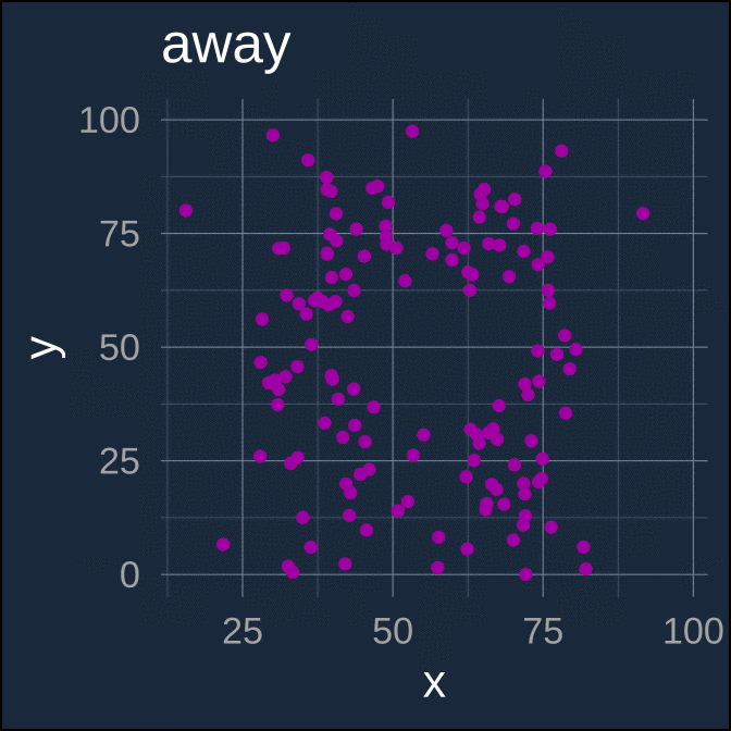
Again, each separate data series here has nearly identical parametric summaries
metrics code
| dataset | x_mean | x_sd | y_mean | y_sd | xy_cor |
|---|---|---|---|---|---|
| away | 54.266 | 16.770 | 47.835 | 26.940 | −0.064 |
| bullseye | 54.269 | 16.769 | 47.831 | 26.936 | −0.069 |
| circle | 54.267 | 16.760 | 47.838 | 26.930 | −0.068 |
| dino | 54.263 | 16.765 | 47.832 | 26.935 | −0.064 |
| dots | 54.260 | 16.768 | 47.840 | 26.930 | −0.060 |
| h_lines | 54.261 | 16.766 | 47.830 | 26.940 | −0.062 |
| high_lines | 54.269 | 16.767 | 47.835 | 26.940 | −0.069 |
| slant_down | 54.268 | 16.767 | 47.836 | 26.936 | −0.069 |
| slant_up | 54.266 | 16.769 | 47.831 | 26.939 | −0.069 |
| star | 54.267 | 16.769 | 47.840 | 26.930 | −0.063 |
| v_lines | 54.270 | 16.770 | 47.837 | 26.938 | −0.069 |
| wide_lines | 54.267 | 16.770 | 47.832 | 26.938 | −0.067 |
| x_shape | 54.260 | 16.770 | 47.840 | 26.930 | −0.066 |
Mapping
More should be more in the spatial metaphor
More should be up
Less-to-more should probably move from Left-to-right
-
More should be more distinct from background color
Darker for the default “white” page
Lighter for darkmode
More should be larger or thicker, less should be smaller or thinner
Colors should adhere to, or at least not cross-cut the visual culture
green = go, red = stop
red = hot, blue = cold