── Attaching packages ─────────────────────────────────────── tidyverse 1.3.2 ──
✔ tibble  3.1.8      ✔ dplyr   1.0.10
✔ tidyr   1.2.1      ✔ stringr 1.5.0
✔ readr   2.1.3      ✔ forcats 0.5.2
✔ purrr   0.3.5
── Conflicts ────────────────────────────────────────── tidyverse_conflicts() ──
✖ dplyr::filter() masks stats::filter()
✖ dplyr::lag() masks stats::lag()Scales formatters
Attaching package: 'scales'The following object is masked from 'package:purrr':
discardThe following object is masked from 'package:readr':
col_factor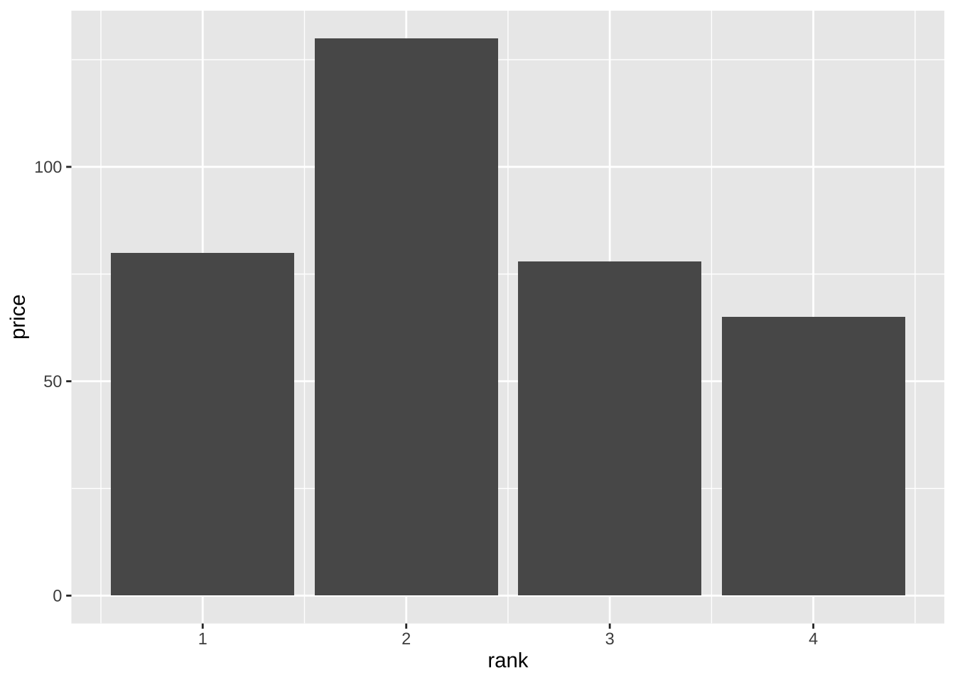
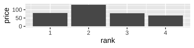
wine_baseplot+
  scale_x_continuous(
    labels = label_ordinal()
  )+
  scale_y_continuous(
    labels = label_dollar()
  )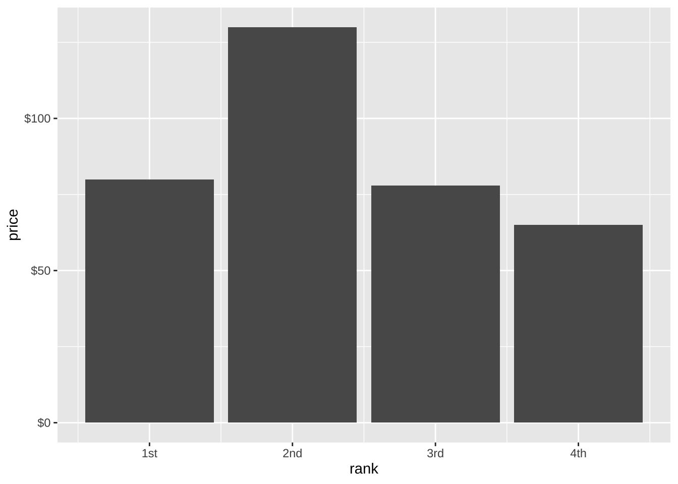
wine_baseplot+
  scale_x_continuous(
    labels = label_ordinal(
      rules = ordinal_french()
    )
  ) +
  scale_y_continuous(
    labels = label_dollar(
      prefix = "",
      suffix = "\u20ac"
    )
  )
Figure size, caption, alt-text
We can configure the size of figures and other aspects of their appearance in a quarto document by setting certain quarto chunk options.
```{r}
#| label: fig-wine-price
#| fig-width: 4
#| fig-height: 1
#| out-width: 75%
#| fig-align: center
#| fig-cap: "The relationship between wine ranking and price"
#| fig-cap-location: margin
#| fig-alt: "A bar graph representing the relationship between the top four wine's ranks and their price. The most expensive bottle is ranked second."
wine_baseplot
```
Pre-set themes
penguin_baseplot <-
  ggplot(
    data = drop_na(penguins),
    aes(
      x = bill_length_mm,
      y = bill_depth_mm,
      color = species
    )
  )+
  geom_point()+
  facet_wrap(
    ~island,
    labeller = label_both
  )+
  labs(title = "Penguins")

penguin_baseplot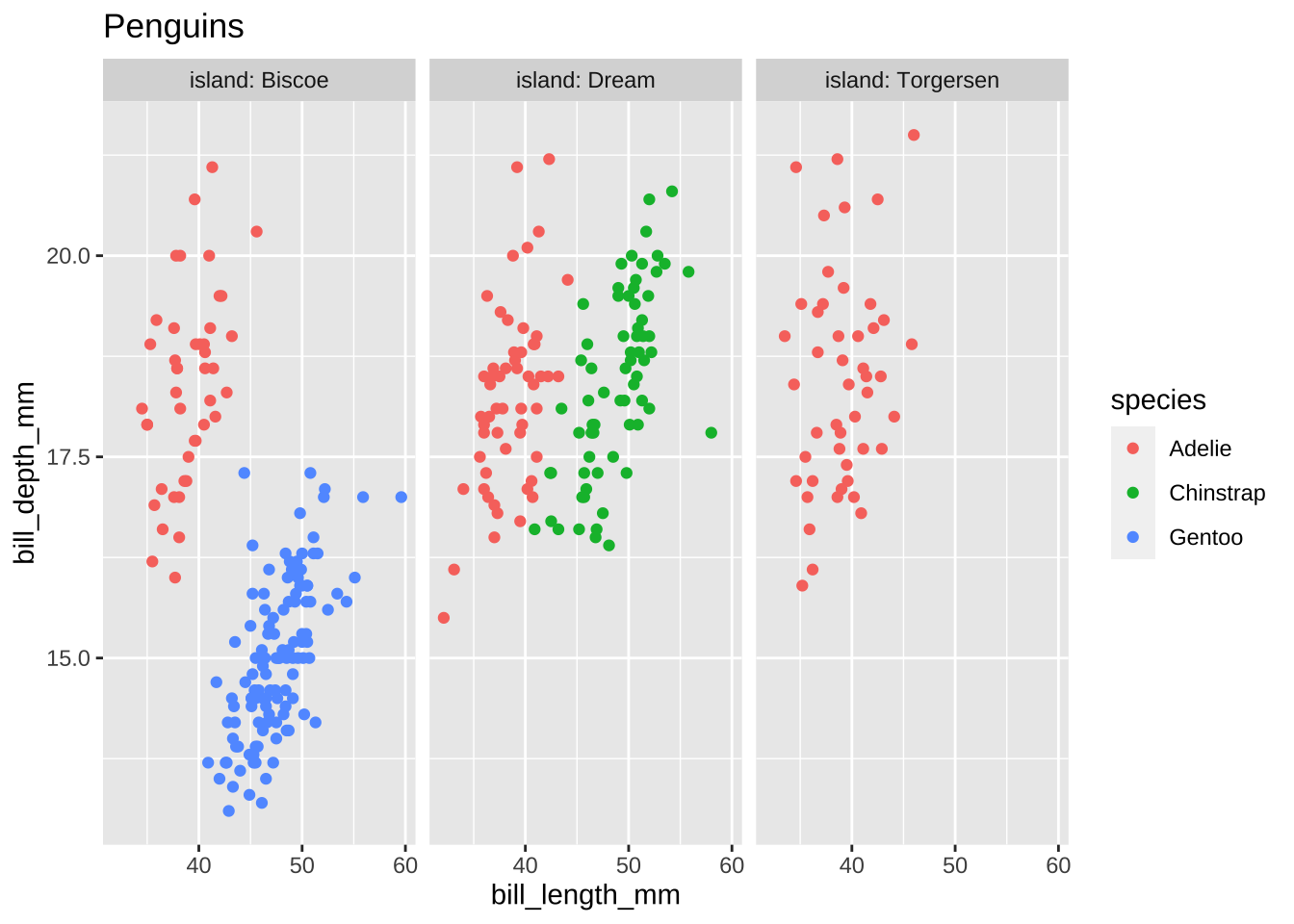
Default themes
penguin_baseplot +
  theme_bw()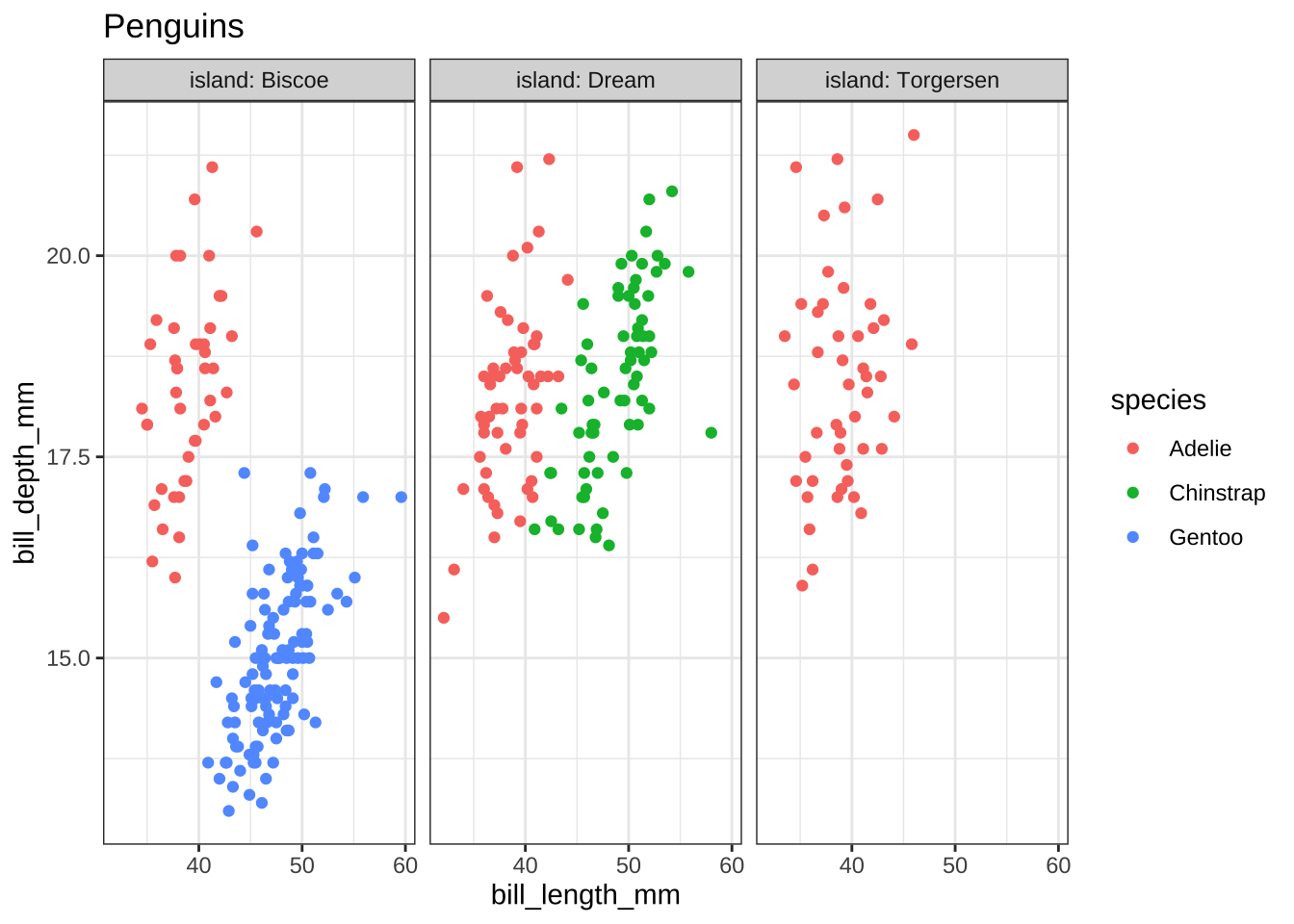
penguin_baseplot+
  theme_minimal()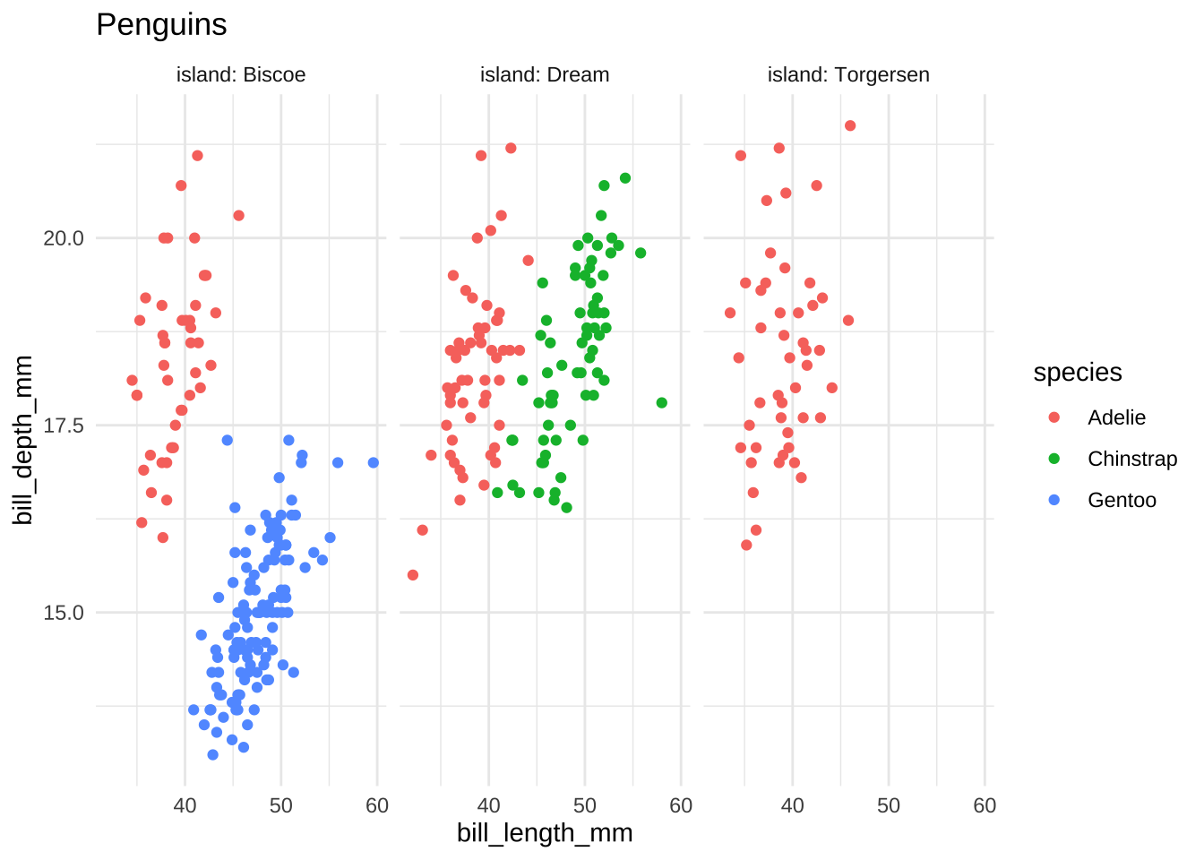
penguin_baseplot +
  theme_void()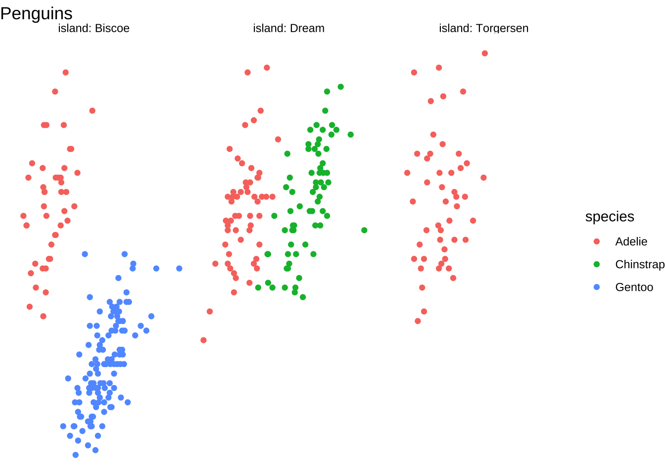
penguin_baseplot +
  theme_dark()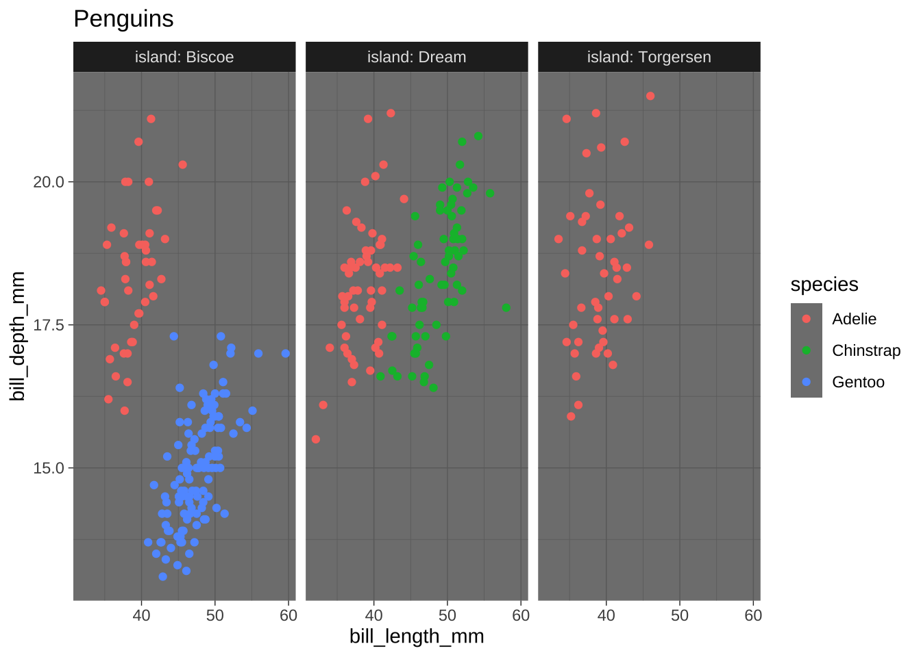
penguin_baseplot +
  theme_light()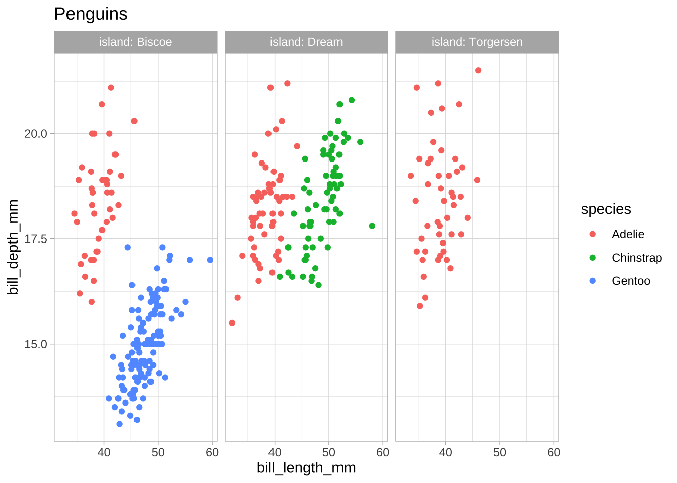
penguin_baseplot +
  theme_classic()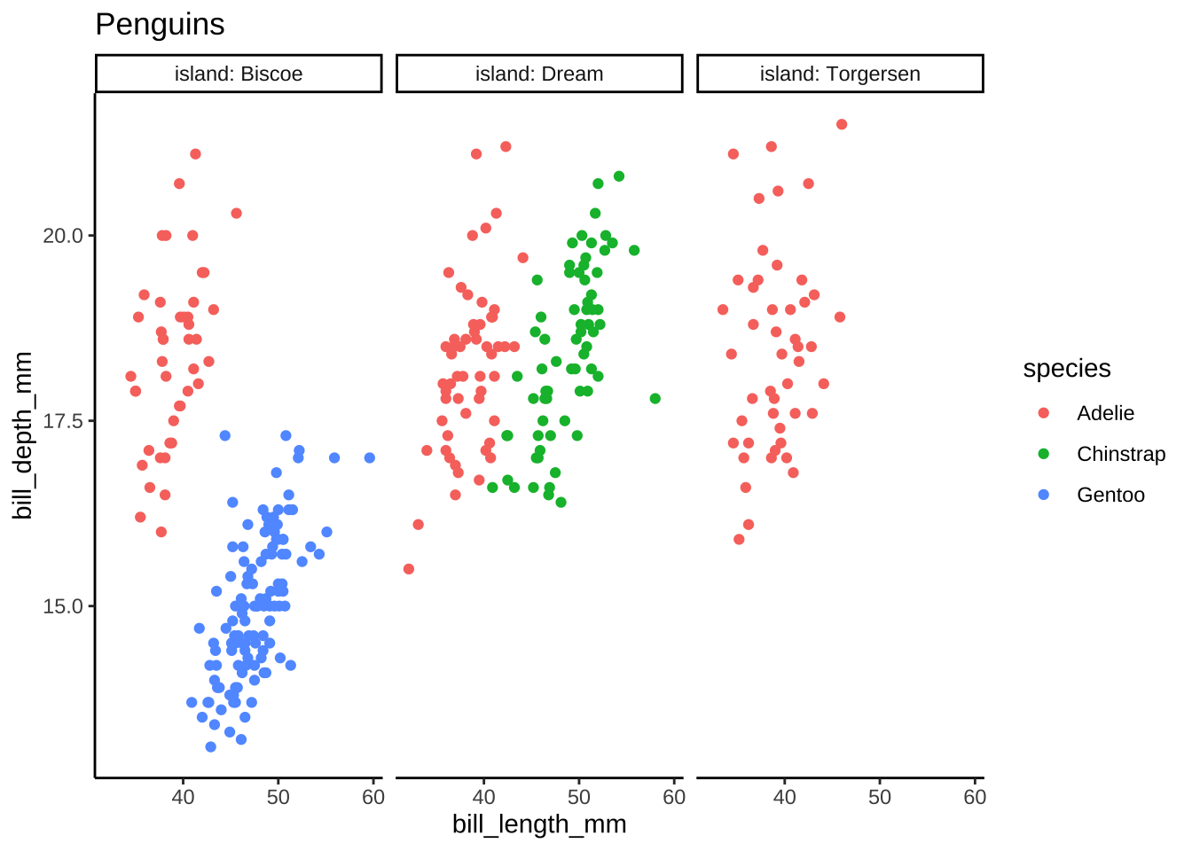
Theme extensions
A limited set of examples
penguin_baseplot +
  theme_tufte()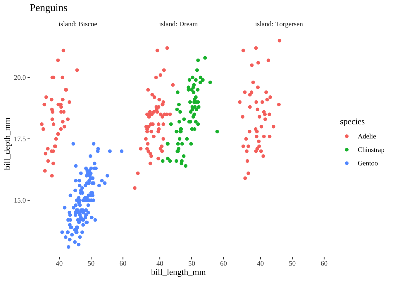
penguin_baseplot +
  theme_fivethirtyeight()+
  scale_color_fivethirtyeight()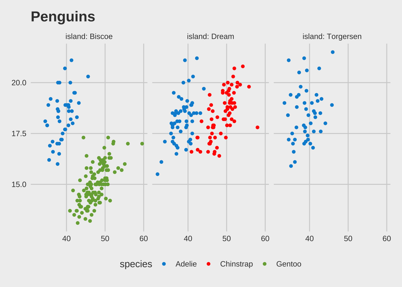
penguin_baseplot +
  theme_excel()+
  scale_color_excel()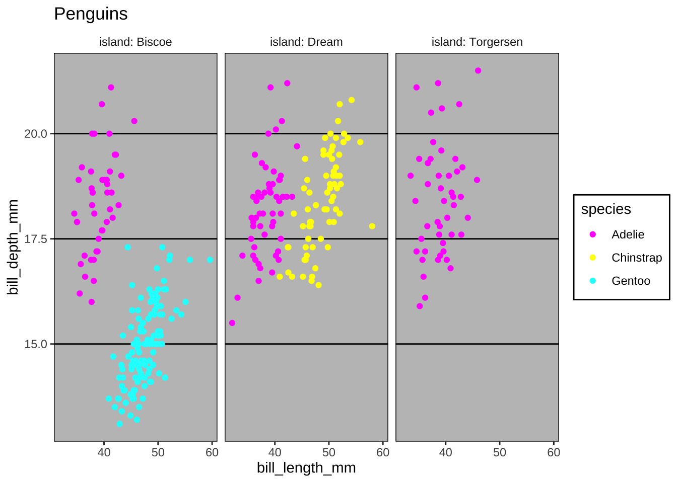
penguin_baseplot +
  theme_economist()+
  scale_color_economist()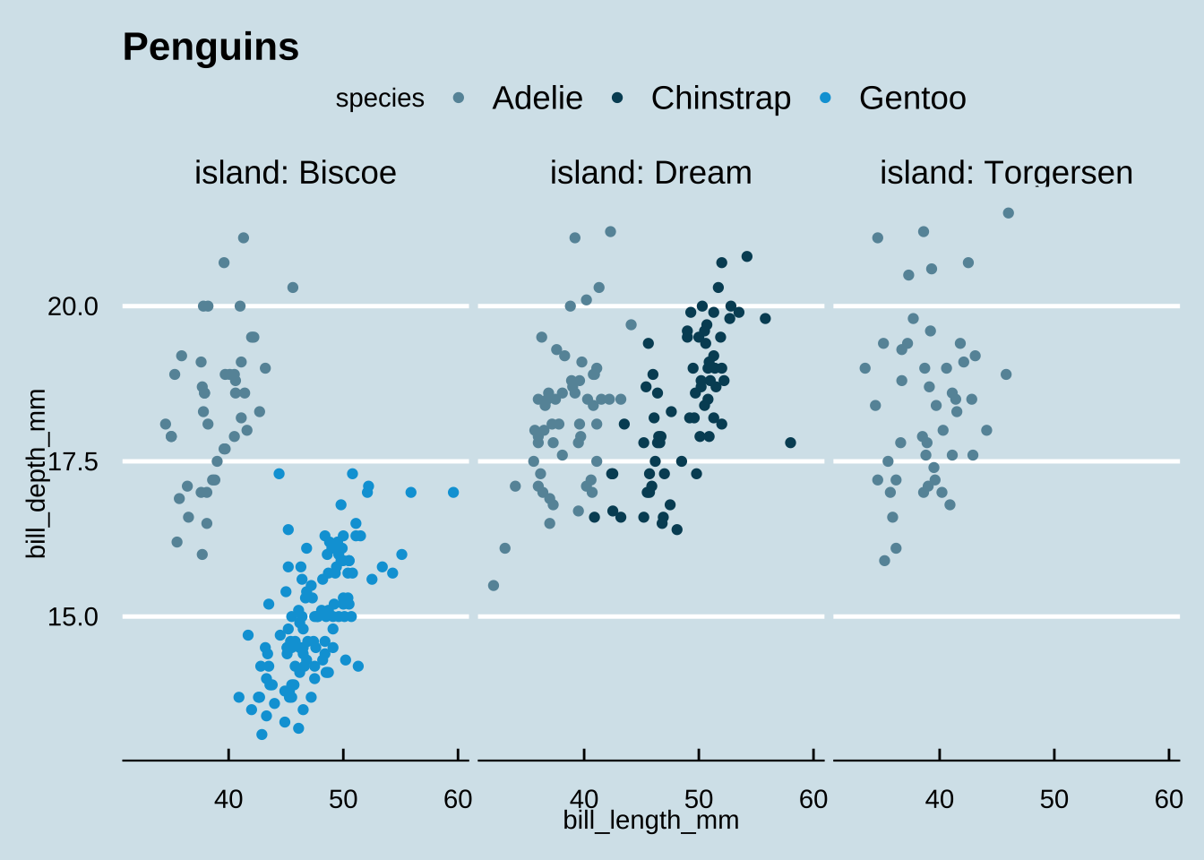
penguin_baseplot +
  theme_wsj()+
  scale_color_wsj()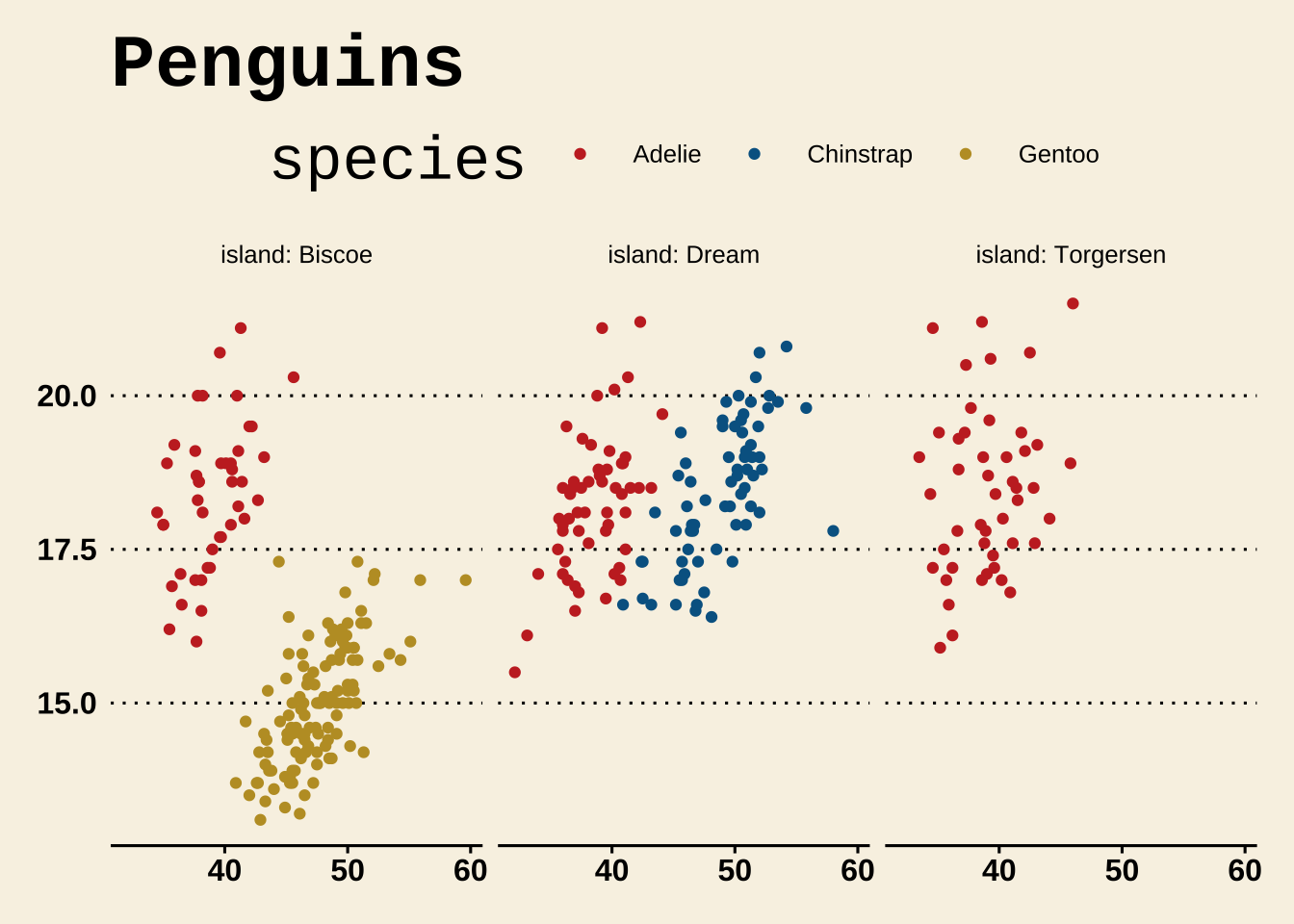
penguin_baseplot +
  theme_stata() +
  scale_color_stata()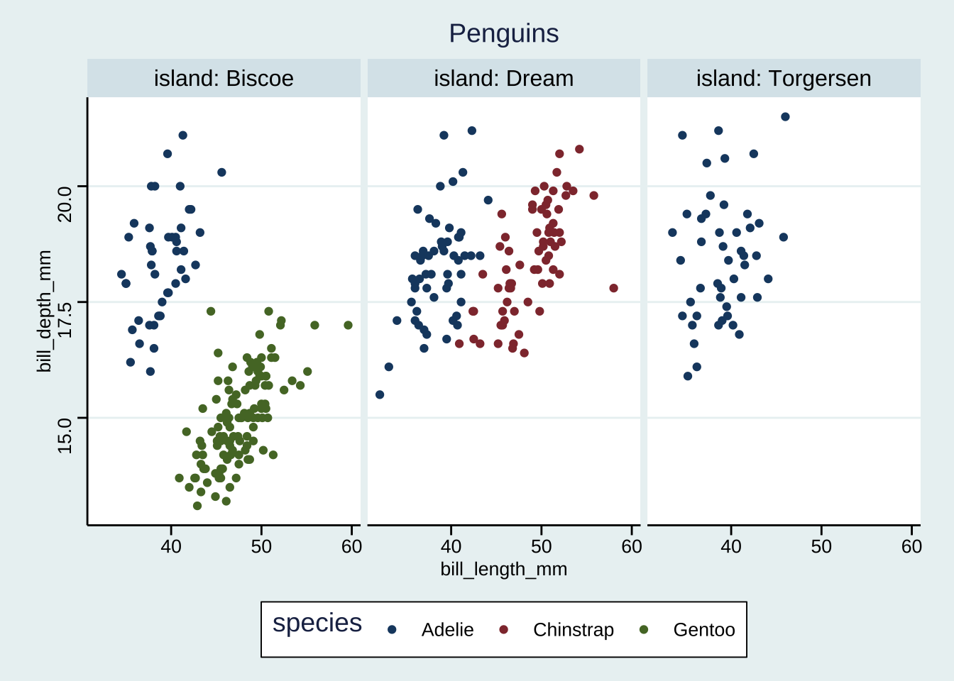
Dark mode
{ggdark} has a number of dark mode themes based on the default ggplot2 themes, as well as ggdark::dark_mode() to turn any given theme “darkmode”
library(ggdark)penguin_baseplot +
dark_theme_grey()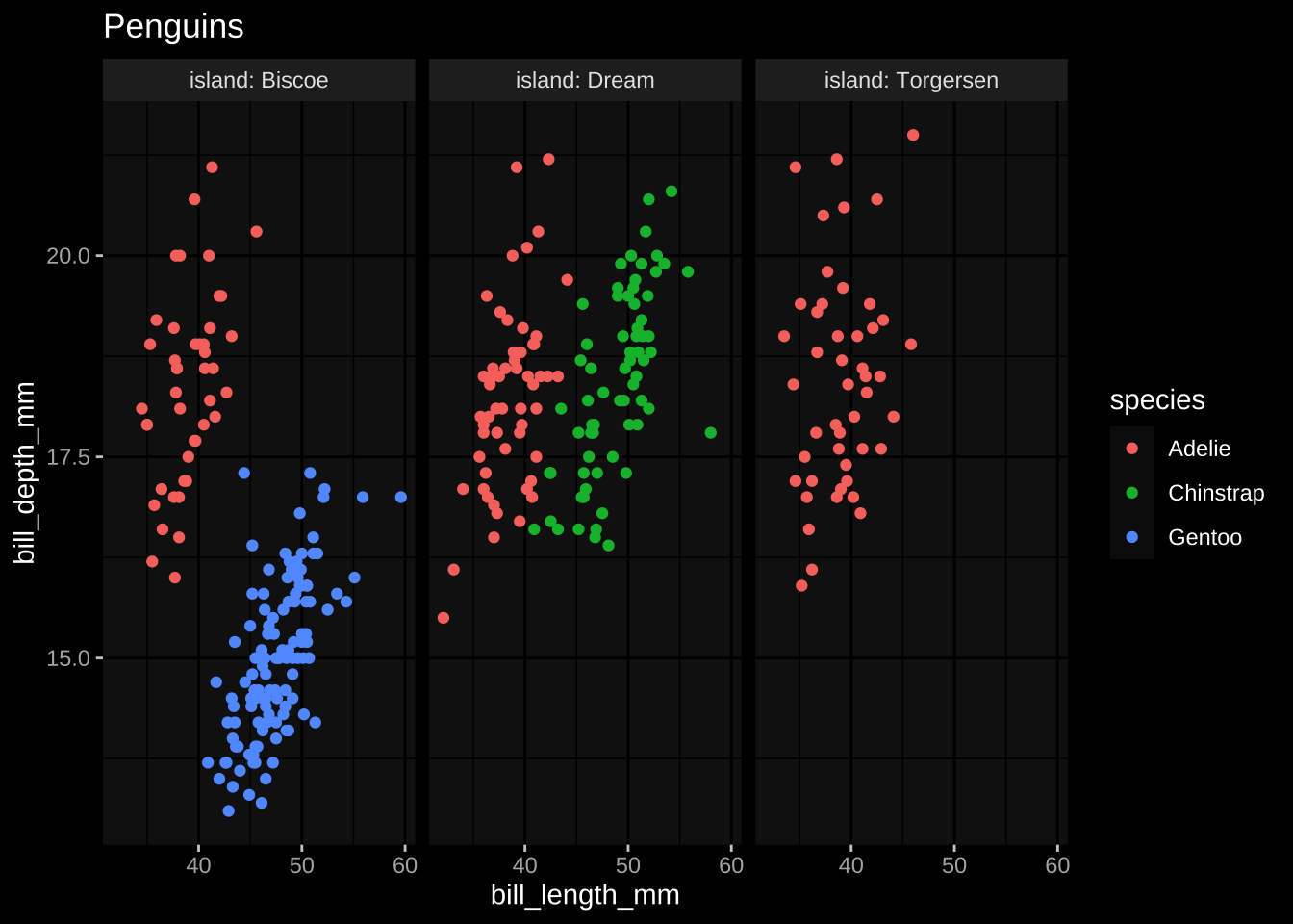
penguin_baseplot +
  dark_mode(theme_stata())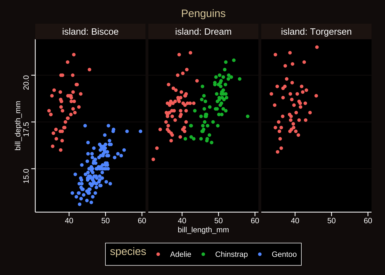
Taking control of themes
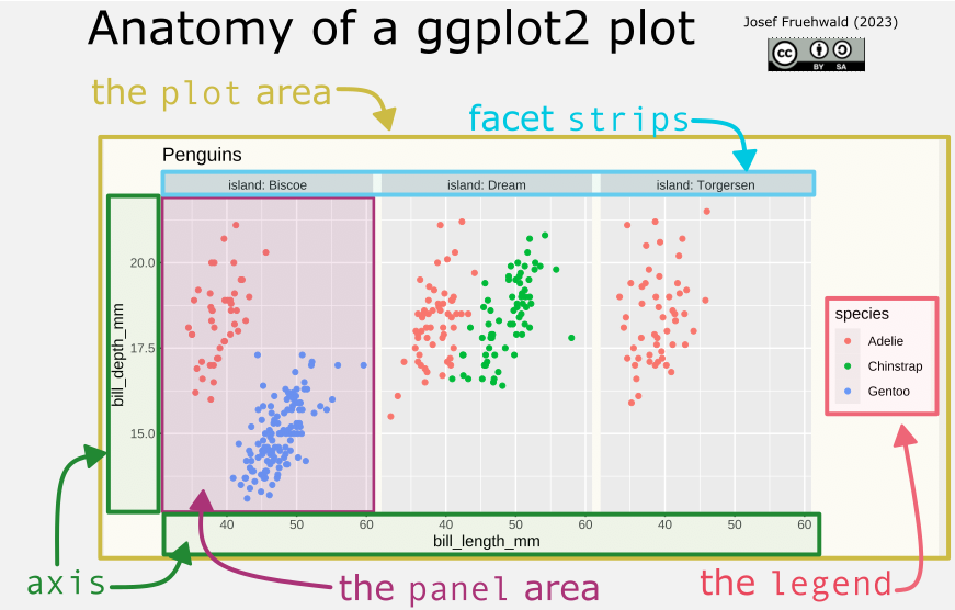
Each plot theme component is made up of one of the following:
rectangles,
ggplot2::element_rect()lines,
ggplot2::element_line()text,
ggplot2::element_text()
For example, to change the polarizing grey background to a different color, we need to
identify what component of the plot we want to change (the
panel)identify what aspect of of that component we want to change (
panel.background)identify what element we’re modifying (
element_rect)
penguin_baseplot +
  theme(
    panel.background = element_rect(fill = "steelblue")
  )+
  labs(caption = "this is not a better color solution")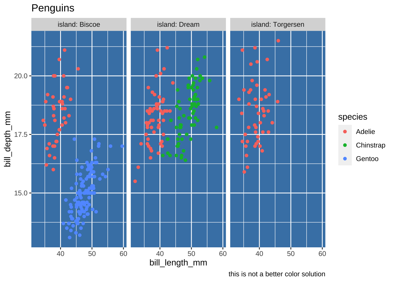
Often it makes sense to start with an existing theme, and then start tweaking it.
penguin_baseplot +
theme_minimal(
# change font size
base_size = 14
) +
theme(
# drop the "minor" breaks
panel.grid.minor = element_blank(),
# slender grey dashed major breaks
panel.grid.major = element_line(
color = "grey80",
linewidth = 0.25,
linetype = "dashed"
),
# dashed border around each facet
panel.border = element_rect(
fill = NA,
color = "grey50",
linetype = "dashed"
),
# move the legend to the top
legend.position = "top",
# force each plotting area to be square
aspect.ratio = 1
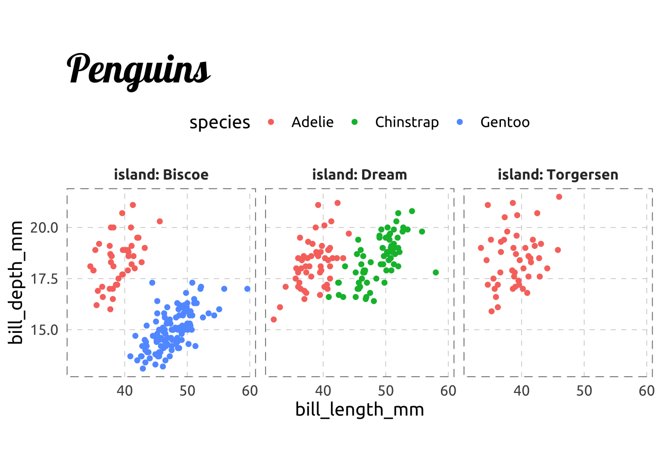
) -> sticker_plot
sticker_plot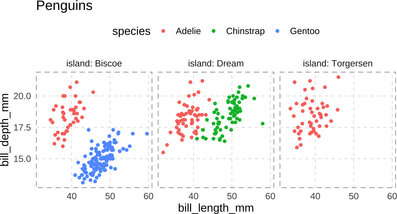
Fonts
To change the font of a plot, you need to use the family argument in element_text().
Getting fonts to show up right in an R plot is an ongoing struggle, but the recent showtext package improves things a bit. Let’s experiment by adding two fonts from google fonts.
library(showtext)
font_add_google(name = "Lobster", family = "Lobster")
font_add_google(name = "Ubuntu", family = "Ubuntu")
sticker_plot +
theme(
text = element_text(family = "Ubuntu"),
plot.title = element_text(family = "Lobster", size = 30),
strip.text = element_text(face = "bold", color = "grey20")
)