library(tidyverse)
library(broom)
library(patchwork)
library(here)
library(gt)
source(here("_defaults.R"))
Listening
Classic Base Rate Issues
flowchart TD p["population<br>10,000 individuals"] --> |0.01| v["🧛♂️<br>100 individuals"] p--> |0.99| h["👨<br>9,900 individuals"] v --> |0.95| vpos["🧛♂️➕<br>95 individuals"] v --> |0.05| vneg["🧛♂️➖Test Negative<br>5 individuals"] h --> |0.01| hpos["👨➕<br>99 individuals"] h --> |0.99| hneg["👨➖Test Negative<br>9,801 individuals"] vpos --o pos["(🧛♂️,👨)➕<br>194"] hpos --o pos vneg --o neg["(🧛♂️, 👨)➖<br>9806"] hneg --o neg
Plot of the base rate vs P(vampire | positive test)
tibble(
  # might as well get logarithmic
  base_rate = 10^(seq(-3, -1, length = 20)),
  vamp_and_pos = base_rate * 0.95,
  vamp_and_neg = base_rate * 0.05,
  human_and_pos = (1-base_rate) * 0.01,
  human_and_neg = (1-base_rate) * 0.99,
  p_vamp_pos = vamp_and_pos/(vamp_and_pos + human_and_pos),
  p_hum_neg = human_and_neg/(vamp_and_neg + human_and_neg)
) -> test_metrics
test_metrics |>
ggplot(aes(base_rate, p_vamp_pos))+
geom_point(color = "steelblue",
size = 3)+
geom_line(color = "steelblue",
linewidth = 1)+
scale_x_log10()+
ylim(0,1)+
labs(x = "P(vampire)",
y = "P(vampire | positive)",
subtitle = "P(positive | vampire) = 0.95\nP(positive | human) = 0.01",
title = "Positive Predictive Value") +
theme(plot.subtitle = element_text(size = 12))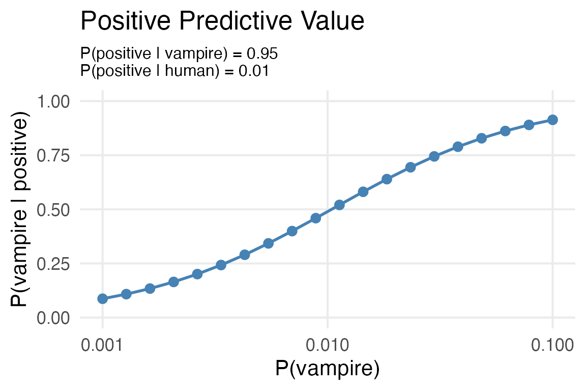
test_metrics |>
  ggplot(aes(base_rate, p_hum_neg))+
    geom_point(color = "steelblue",
               size = 3)+
    geom_line(color = "steelblue",
              linewidth = 1)+
    scale_x_log10()+
    labs(x = "P(vampire)",
         y = "P(human | negative)",
         subtitle = "P(positive | vampire) = 0.95\nP(positive | human) = 0.01",
         title = "Negative Predictive Value") +
    theme(plot.subtitle = element_text(size = 12))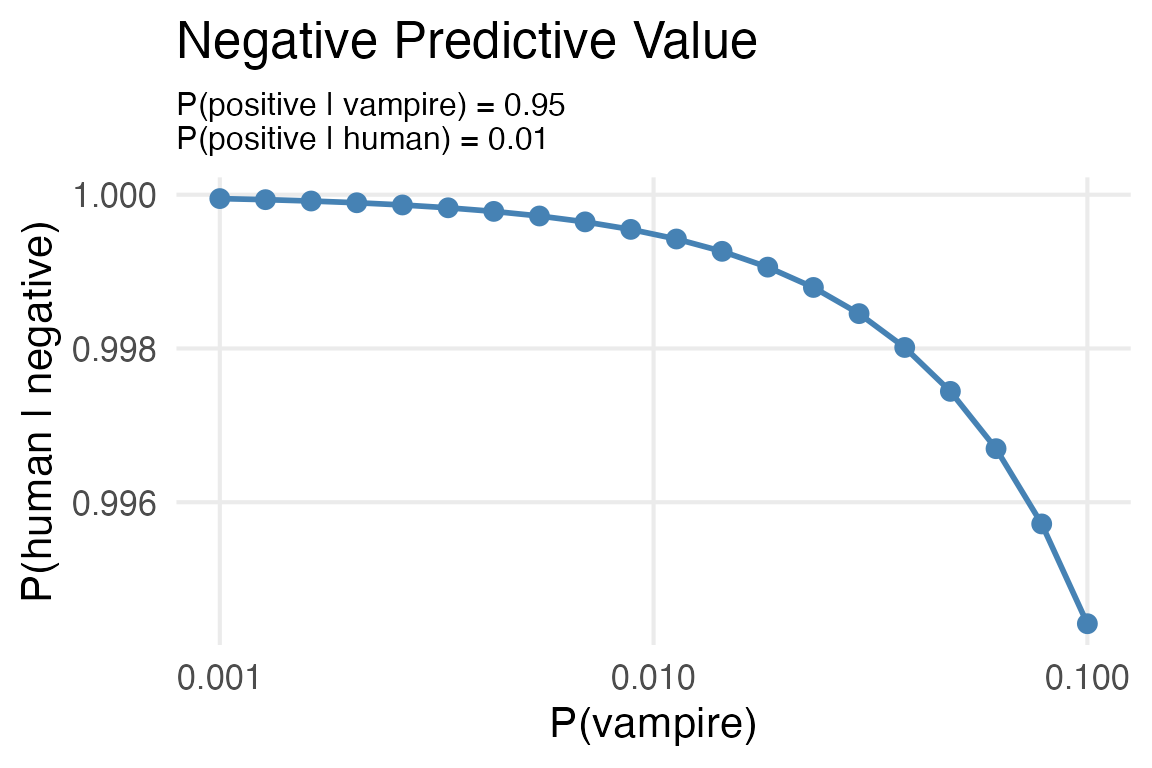
Tibble grid sampling
Estimating posterior density from grid sampling.
grid <- tibble(
  # The grid
  prob = seq(0.0001, 0.9999, length = 5000),

  # the prior
  prior_unstd = exp(-abs(prob - .5) / .25),
  prior_std = prior_unstd/sum(prior_unstd),

  # the data
  data = dbinom(6, size = 9, prob = prob),

  # the posterior
  posterior_unstd = prior_std * data,
  posterior = posterior_unstd / sum(posterior_unstd)
)
grid |>
ggplot(aes(prob, prior_std))+
geom_line()+
labs(y = "prior density",
title = "Prior") ->
prior_plot
grid |>
ggplot(aes(prob, data))+
geom_line()+
labs(y = "data density",
title = "Data") ->
data_plot
grid |>
ggplot(aes(prob, posterior))+
geom_line() +
labs(y = "posterior density",
title = "Posterior") ->
posterior_plot
prior_plot | data_plot | posterior_plot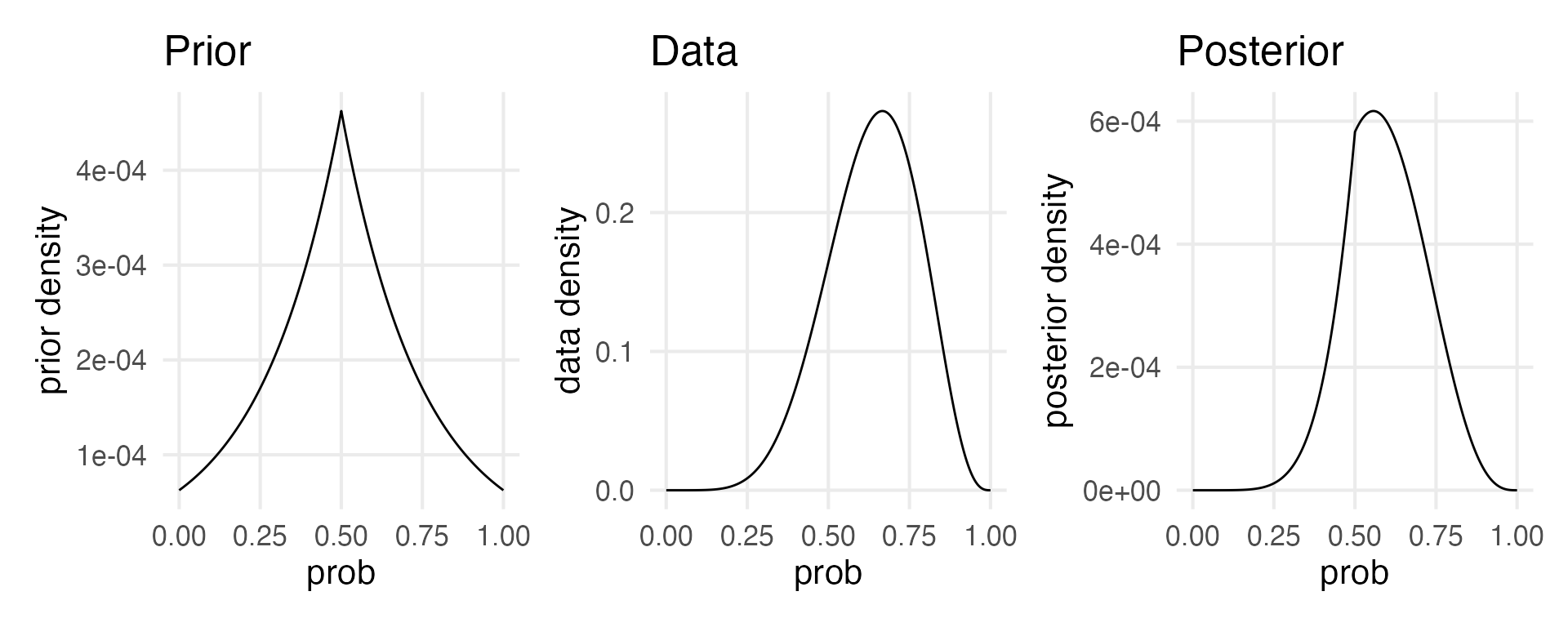
Sampling from the posterior, using sample_n().
grid |>
  sample_n(size = 1e4,
           replace = T,
           weight = posterior)->
posterior_sampleshead(posterior_samples)# A tibble: 6 × 6
prob prior_unstd prior_std data posterior_unstd posterior
<dbl> <dbl> <dbl> <dbl> <dbl> <dbl>
1 0.703 0.444 0.000205 0.266 0.0000546 0.000419
2 0.694 0.461 0.000213 0.269 0.0000574 0.000441
3 0.670 0.507 0.000234 0.273 0.0000640 0.000491
4 0.559 0.789 0.000365 0.220 0.0000803 0.000616
5 0.620 0.619 0.000286 0.262 0.0000749 0.000575
6 0.632 0.591 0.000273 0.267 0.0000729 0.000559I’m going to mess around with finessing the visualizations here.
renv::install("tidybayes")library(tidybayes)posterior_samples |>
pull(prob) |>
density() |>
tidy() |>
rename(prob = x, density = y) ->
posterior_dens
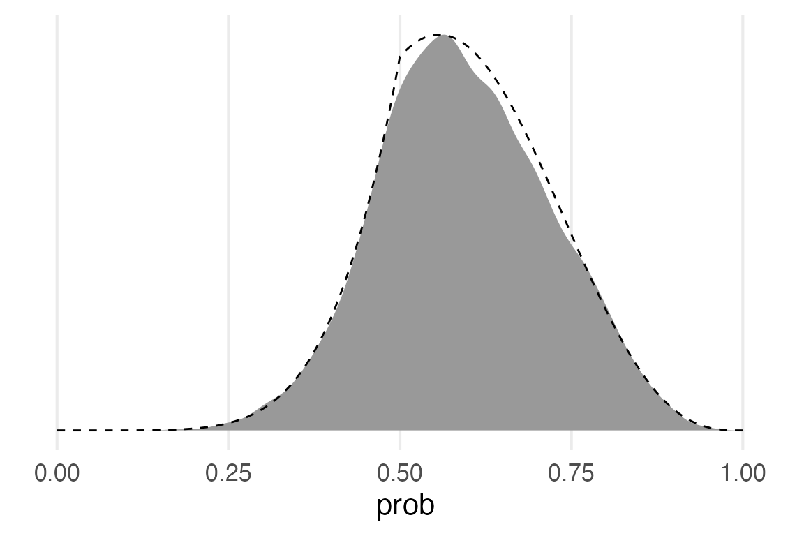
posterior_dens |>
ggplot(aes(prob, density/max(density)))+
geom_area(fill = "grey60")+
geom_line(aes(y = posterior/max(posterior)),
linetype = 2,
data = grid)+
theme(
axis.title.y = element_blank(),
axis.text.y = element_blank(),
panel.grid.major.y = element_blank()
)
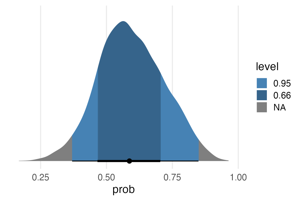
posterior_samples |>
  median_hdci(prob, .width = c(0.5, 0.95)) ->
  intervals
intervals |>
  gt() |>
fmt_number(decimals = 2)| prob | .lower | .upper | .width | .point | .interval |
|---|---|---|---|---|---|
| 0.59 | 0.48 | 0.65 | 0.50 | median | hdci |
| 0.59 | 0.37 | 0.85 | 0.95 | median | hdci |
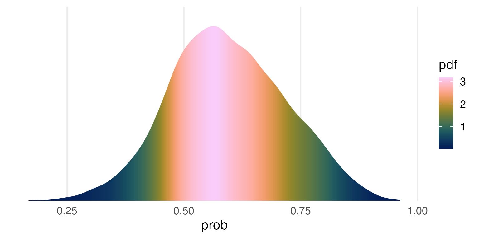
posterior_samples |>
  ggplot(aes(prob))+
    stat_slab(aes(fill = after_stat(pdf)),
              fill_type = "gradient")+
    scale_y_continuous(expand = expansion(mult = c(0,0)))+
    khroma::scale_fill_batlow() +
    theme(
      axis.title.y = element_blank(),
      axis.text.y = element_blank(),
      panel.grid.major.y = element_blank()
    )
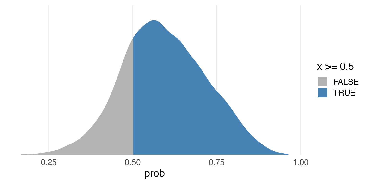
posterior_samples |>
  ggplot(aes(prob))+
    stat_slab(
      aes(fill = after_stat(x >= 0.5)),
      fill_type = "gradient"
    ) +
    scale_fill_manual(
      values = c(
        "grey70",
        "steelblue"
      )
    )+
   scale_y_continuous(expand = expansion(mult = c(0,0)))+
   theme(
      axis.title.y = element_blank(),
      axis.text.y = element_blank(),
      panel.grid.major.y = element_blank()
    )
posterior_samples |>
  ggplot(aes(prob))+
    stat_halfeye(
      aes(fill = after_stat(level)),
      fill_type = "gradient",
      point_interval = "median_hdi"
    ) +
   scale_y_continuous(expand = expansion(mult = c(0.05,0)))+
   scale_fill_manual(
     values = c("steelblue", "steelblue4")
   )+
   theme(
      axis.title.y = element_blank(),
      axis.text.y = element_blank(),
      panel.grid.major.y = element_blank()
    )
Can I get the plot into a {gt} table? I thin I’ll need to map over the widths? I’m going off of this gt help page: https://gt.rstudio.com/reference/ggplot_image.html. Let me get the plot right first.
posterior_samples |>
  ggplot(aes(prob))+
    stat_slab(
      aes(fill = after_stat(level)),
      .width = 0.66,
      fill_type = "gradient",
      point_interval = "median_hdci"
    ) +
    stat_slab(
      fill = NA,
      color = "black"
    )+
    scale_x_continuous(
      limits = c(0,1),
      expand = expansion(mult = c(0,0))
    )+
    scale_y_continuous(
      expand = expansion(mult = c(0,0))
    )+
    scale_fill_manual(values = "steelblue",
                      guide = "none")+
    theme_void()
make_table_plot <- function(.width, data) {
  ggplot(data, aes(prob))+
    stat_slab(
      aes(fill = after_stat(level)),
      .width = .width,
      point_interval = "median_hdci"
    ) +
    stat_slab(
      fill = NA,
      color = "black"
    )+
    scale_x_continuous(
      limits = c(0,1),
      expand = expansion(mult = c(0,0))
    )+
    scale_y_continuous(
      expand = expansion(mult = c(0,0))
    )+
    scale_fill_manual(values = "steelblue",
                      guide = "none")+
    theme_void()
}
Map that function over the intervals table I made before.
intervals |>
  mutate(
    ggplot = map(.width, ~make_table_plot(.x, posterior_samples)),

    ## adding an empty column
    dist = NA
  ) -> to_tibble

to_tibble |>
  select(-ggplot) |>
  gt() |>
  text_transform(
    locations = cells_body(columns = dist),
    fn = \(x) map(to_tibble$ggplot, ggplot_image, aspect_ratio = 2)
)| prob | .lower | .upper | .width | .point | .interval | dist |
|---|---|---|---|---|---|---|
| 0.587 | 0.4815000 | 0.6503000 | 0.50 | median | hdci |  |
| 0.587 | 0.3695874 | 0.8489874 | 0.95 | median | hdci |  |
I’d like more control over how the image appears in the table. Looks like I’ll have to ggsave, and then embed.
make_custom_table_plot <- function(p){
  filename <- tempfile(fileext = ".png")
  ggsave(plot = p,
         filename = filename,
         device = ragg::agg_png,
         res = 100,
         width =1.5,
         height = 0.75)
  local_image(filename=filename)
}
to_tibble |>
select(-ggplot) |>
gt() |>
text_transform(
locations = cells_body(columns = vars(dist)),
fn = \(x) map(to_tibble$ggplot, make_custom_table_plot)
)| prob | .lower | .upper | .width | .point | .interval | dist |
|---|---|---|---|---|---|---|
| 0.587 | 0.4815000 | 0.6503000 | 0.50 | median | hdci |  |
| 0.587 | 0.3695874 | 0.8489874 | 0.95 | median | hdci |  |
There we go!
Turns out this local_image() thing doesn’t play nice with conversion to pdf (😕).
BRMS
library(brms)tibble(
water = 6,
samples = 9
)->
water_to_modelwater_form <- bf(
water | trials(samples) ~ 1,
family = binomial(link = "identity")
)brm(
water | trials(samples) ~ 1,
data = water_to_model,
family = binomial(link = "identity"),
prior(beta(1, 1), class = Intercept, ub = 1, lb = 0),
file_refit = "on_change",
file = "water_fit.rds"
) ->
water_modelwater_model Family: binomial
Links: mu = identity
Formula: water | trials(samples) ~ 1
Data: water_to_model (Number of observations: 1)
Draws: 4 chains, each with iter = 2000; warmup = 1000; thin = 1;
total post-warmup draws = 4000
Population-Level Effects:
Estimate Est.Error l-95% CI u-95% CI Rhat Bulk_ESS Tail_ESS
Intercept 0.64 0.14 0.35 0.88 1.00 1598 1945
Draws were sampled using sampling(NUTS). For each parameter, Bulk_ESS
and Tail_ESS are effective sample size measures, and Rhat is the potential
scale reduction factor on split chains (at convergence, Rhat = 1).library(gtsummary)water_model |>
gtsummary::tbl_regression(intercept = T)| Characteristic | Beta | 95% CI1 |
|---|---|---|
| (Intercept) | 0.64 | 0.35, 0.88 |
| 1 CI = Credible Interval | ||
Let’s do this again.
water_model |>
  get_variables()
[1] "b_Intercept" "lprior" "lp__" "accept_stat__"
[5] "stepsize__" "treedepth__" "n_leapfrog__" "divergent__"
[9] "energy__" water_model |>
gather_draws(b_Intercept)->
model_draws
model_draws |>
head() |>
rmarkdown::paged_table()model_draws |>
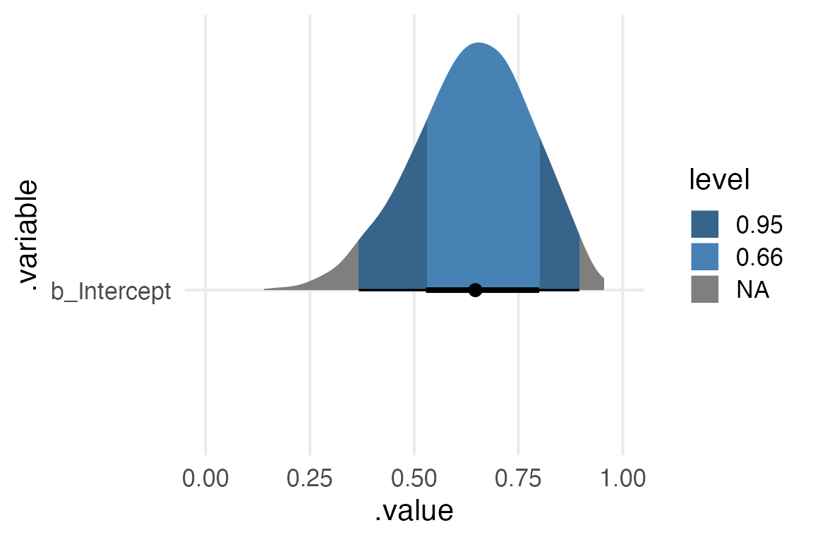
ggplot(aes(.value, .variable)) +
stat_halfeye(
point_interval = median_hdi,
aes(fill = after_stat(level)),
fill_type = "gradient"
) +
xlim(0,1)+
scale_fill_manual(
values = c("steelblue4", "steelblue"),
)