DAGs part 1

Author
Published

July 5, 2023

Listening

So, as a linguist, the only Directed Acyclic Graphs I’ve ever worked with are syntax trees. I don’t know if it’s embarrassing that I’ve never really utilized them in my statistical analysis, but I’ll start to now!

Setup

setup
library(tidyverse)
library(tidybayes)
library(gt)
library(gtsummary)
library(patchwork)
library(ggblend)

library(brms)
library(marginaleffects)

source(here::here("_defaults.R"))
knitr::opts_chunk$set(dev = "png", dev.args = list(type = "cairo-png"))

New packages for today.

library(dagitty)
library(ggdag)
data(WaffleDivorce, package = "rethinking")

The WaffleDivorce data

I’ll leave the Location and Loc columns out of the overall summary.

WaffleDivorce |> 
  select(
    -Location, -Loc
  ) |> 
  gtsummary::tbl_summary()
Characteristic N = 501
Population 4.4 (1.6, 6.7)
MedianAgeMarriage 25.90 (25.33, 26.75)
Marriage 19.7 (17.1, 22.1)
Marriage.SE 1.19 (0.81, 1.77)
Divorce 9.75 (8.30, 10.90)
Divorce.SE 0.80 (0.57, 1.26)
WaffleHouses 1 (0, 40)
South 14 (28%)
Slaves1860 0 (0, 80,828)
Population1860 407,722 (43,321, 920,977)
PropSlaves1860 0.00 (0.00, 0.09)
1 Median (IQR); n (%)

I’m not sure why everyone likes assigning the full named data frame to a new variable called d. It’s annoying to type out W a f f l e D i v o r c e , but aren’t we all using IDEs with tab completion?

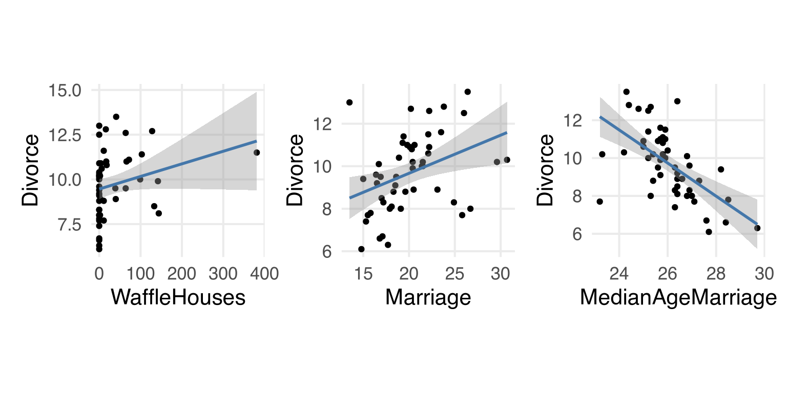
Let’s look at the variables discussed in the chapter.

plotting code
WaffleDivorce |> 
  ggplot(aes(WaffleHouses, Divorce))+
    geom_point() +
    stat_smooth(
      method = lm,
      color = ptol_blue
      )+
    theme(aspect.ratio = 1)->
  waffledivorce_p

WaffleDivorce |> 
  ggplot(aes(Marriage, Divorce))+
    geom_point() +
    stat_smooth(
      method = lm,
      color = ptol_blue
      )+
    theme(aspect.ratio = 1) ->
  marriagedivorce_p

WaffleDivorce |> 
  ggplot(aes(MedianAgeMarriage, Divorce))+
    geom_point() +
    stat_smooth(
      method = lm,
      color = ptol_blue
      )+
    theme(aspect.ratio = 1) ->
  agedivorce_p

waffledivorce_p + marriagedivorce_p + agedivorce_p

Figure 1: The relationship between three variables and divorce rate.

The DAG

The book mostly focuses on the effect of median age at marriage, the marriage rate, and divorce rate, which you can represent as DAG like so:

dagify(
  divorce ~ age,
  divorce ~ marriage,
  marriage ~ age
) |> 
  ggdag(
    text_col = ptol_red
  )+
    theme_void()+
    theme(
      aspect.ratio = 1
    )

Figure 2: DAG attempt 1

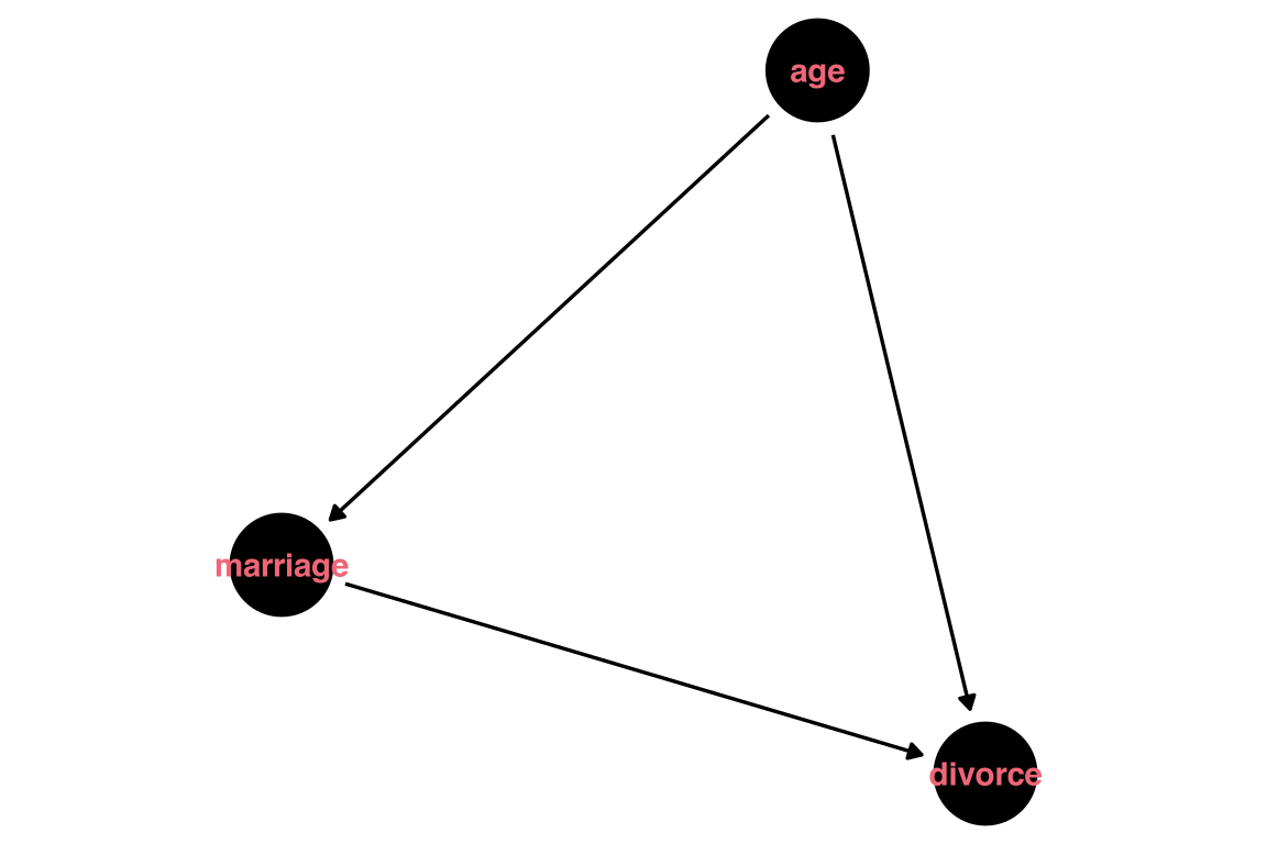
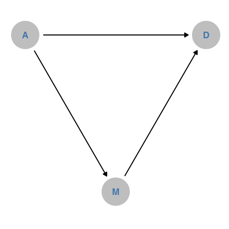
Not quite happy with this first attempt. Looks like I’ll really have to use these single character labels, which I’m not the biggest fan of, to make them fit inside the nodes. Looks like I might also need to do more by-hand adjustment of both the coordinates of each node, and also the aesthetics of the plot.

dagify(
  D ~ A,
  D ~ M,
  M ~ A,
  outcome = "D",
  exposure = "A",
  coords = 
    tribble(
      ~name, ~x, ~y,
      "D", 0, 0,
      "A", -1, 0,
      ## UGH
      "M", -0.5, -sqrt(1-(0.5^2))
    )
) ->
  dam_dag

dam_dag |> 
  tidy_dagitty() |> 
  ggplot(aes(x =x, y = y, xend = xend, yend = yend)) +
    geom_dag_point(
     color = "grey"
    )+
    geom_dag_text(
      color = ptol_blue
    )+
    geom_dag_edges()+
    theme_dag()+
    coord_fixed()

Figure 3: DAG attempt 2

Well, I’m a little annoyed at how manual getting the layout to be exactly like I wanted was, but OK.

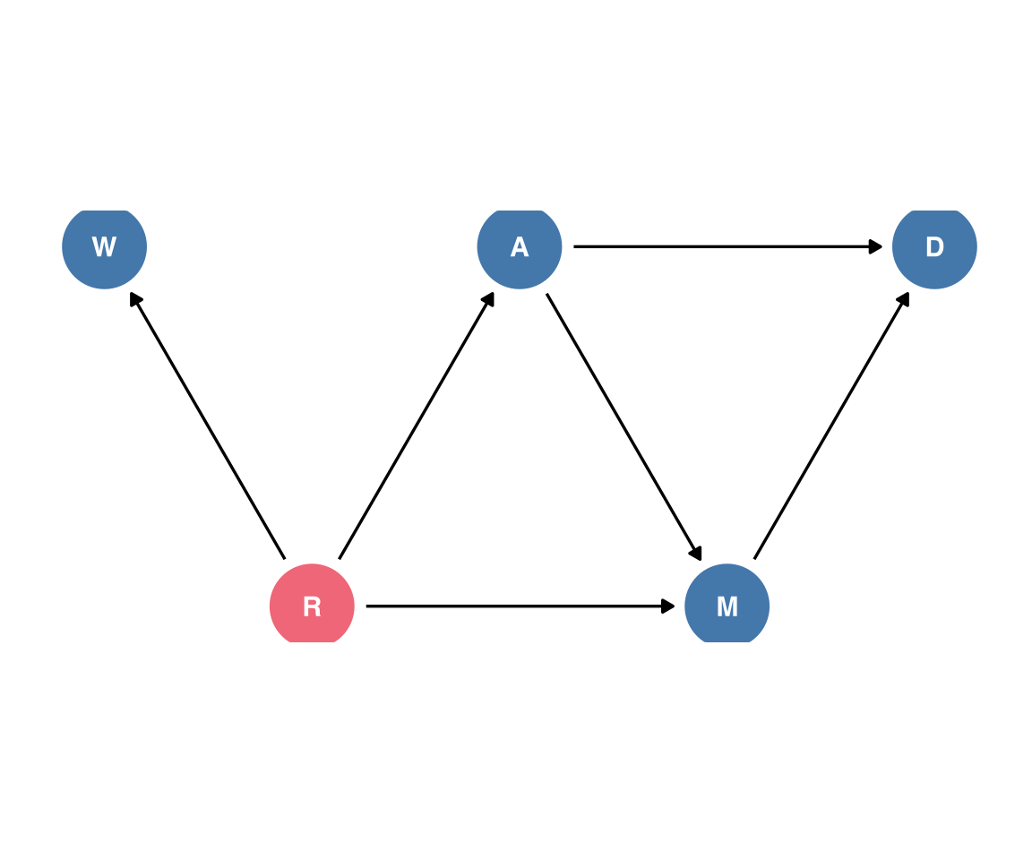
Adding in Waffle Houses

Let’s figure out how to get the number of Waffle Houses into the DAG. I’ll say there’s a latent variable R for Region

dagify(
  D ~ A,
  D ~ M,
  M ~ A,
  W ~ R,
  A ~ R,
  M ~ R,
  outcome = "D",
  exposure = c("M", "A"),
  latent = "R",
  coords = 
    tribble(
      ~name, ~x, ~y,
      "D", 0, 0,
      "A", -1, 0,
      ## UGH
      "M", -0.5, -sqrt(1-(0.5^2)),
      "R", -1.5, -sqrt(1-(0.5^2)),
      "W", -2, 0
    )
) ->
  wrdam_dag

wrdam_dag |> 
 tidy_dagitty() |> 
  ggplot(aes(x =x, y = y, xend = xend, yend = yend)) +
    geom_dag_point(
     aes(
       color = name == "R"
     )
    )+
    geom_dag_text(
      #color = ptol_blue
    )+
    geom_dag_edges() +
    coord_fixed() +
    theme_dag()+
    theme(
      legend.position = "none"
    )

Ok, well, we’ll see how intense I ever get about making these DAG figures.

Doing the Full Luxury Bayes

First, prepping for modelling by standardizing all of the variables.

WaffleDivorce |> 
  mutate(
    divorce_z = (Divorce - mean(Divorce))/sd(Divorce),
    age_z = (MedianAgeMarriage-mean(MedianAgeMarriage))/sd(MedianAgeMarriage),
    marriage_z = (Marriage - mean(Marriage))/sd(Marriage)
  )->
  waffle_to_model

To figure out the model we need to get the “direct effect” of marriage rate on divorce rate, we can use dagitty::adjustmentSets().

dam_dag |> 
  adjustmentSets(
    outcome = "D",
    exposure = "M"
  )
{ A }

So, we need to include median marriage age in the model.

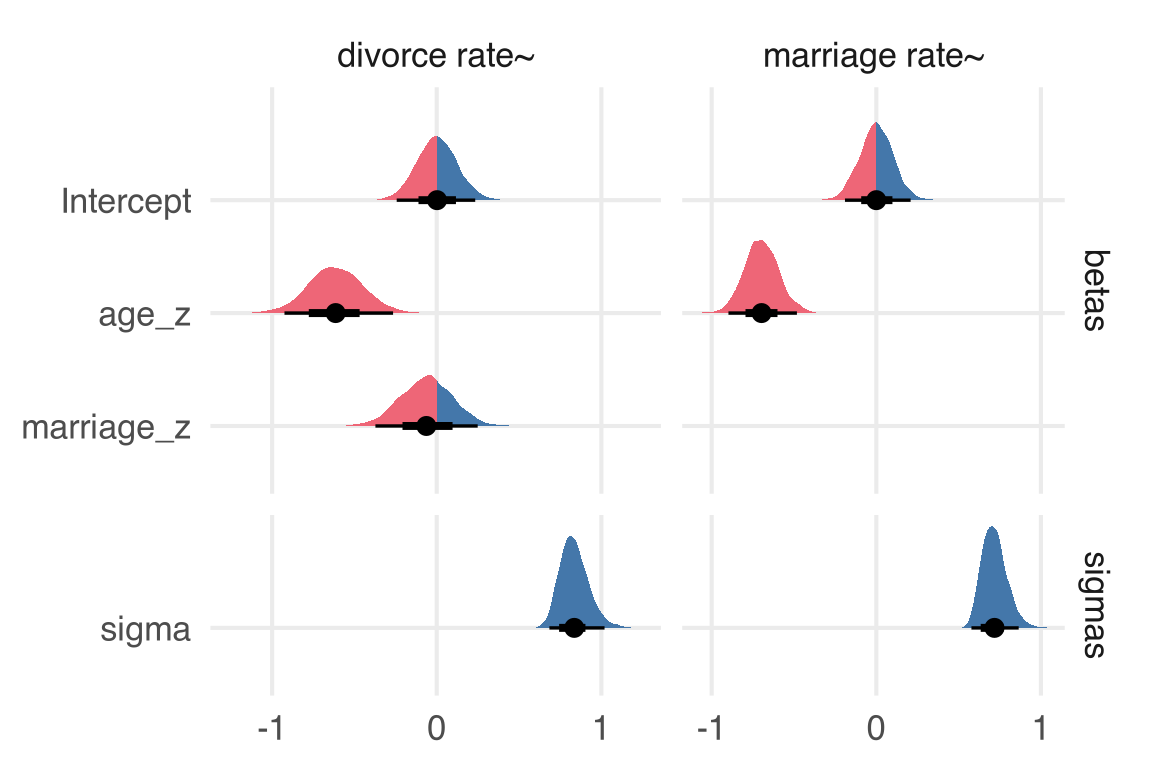
For the “full luxury Bayes” approach, I’ll combine brms formulas to model both the divorce rate and the marriage rate in one go.

waffle_formula <-   bf(
    divorce_z ~ age_z + marriage_z
  )+
  bf(
    marriage_z ~ age_z
  )+
  # not 100% sure this is right
  set_rescor(F)

Let’s look at the default priors. I’m, trying out some more stuff with {gt} here to get a table I like, but it takes up a lot of space so I’m collapsing it. I also need to figure out what kind of behavior makes sense to me for table captions created by quarto and table titles created by {gt}.

table code
get_prior(
  waffle_formula,
  data = waffle_to_model
) |> 
  as_tibble() |> 
  select(
    prior,
    class,
    coef,
    resp
  ) |> 
  group_by(class) |> 
  filter(
    str_length(resp) > 0
  ) |> 
  filter(
    !(class == "b" & coef == "")
  ) |> 
  gt(
    rowname_col = "prior"
  ) |> 
    sub_values(
      columns = prior,
      values = "",
      replacement = "flat"
    ) |> 
    tab_stub_indent(
      rows = everything(),
      indent = 2
    ) |> 
  tab_header(
    title = md("Default `brms` priors")
  )
Default brms priors
coef resp
b
flat age_z divorcez
flat marriage_z divorcez
flat age_z marriagez
Intercept
student_t(3, 0, 2.5) divorcez
student_t(3, -0.1, 2.5) marriagez
sigma
student_t(3, 0, 2.5) divorcez
student_t(3, 0, 2.5) marriagez
Table 1:

Default priors

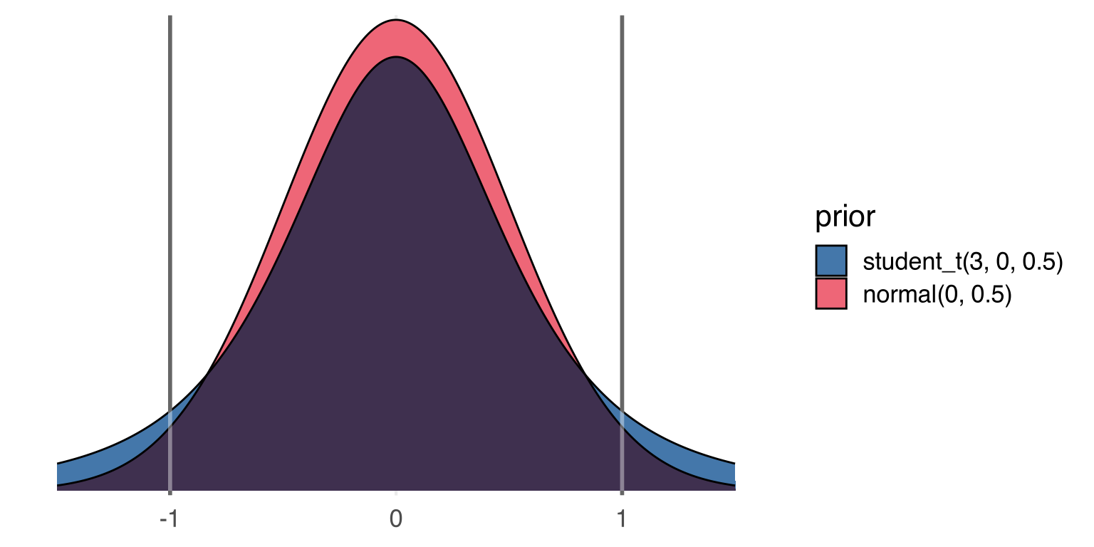
So, a thing that hadn’t really clicked with me until I was teaching from Bodo Winter’s textbook is that if you z-score both the outcome and the predictors in a model, the resulting slopes are Pearson’s r, which is always going to be \(-1 \le \rho \le 1\). Not that we really have to stress it with this particular data and model, efficiencywise, but we can set a prior on these slopes with a relatively narrow scale, and it’ll be pretty reasonable. Here’s a normal(0, 0.5) and a student_t(3, 0, 0.5) for comparison.

plotting code
tibble(
  x = seq(-1.5, 1.5, length = 500),
  dens = dnorm(x, sd = 0.5),
  prior = "normal(0, 0.5)"
) |> 
  bind_rows(
    tibble(
      x = seq(-1.5, 1.5, length = 500),
      dens = dstudent_t(x, df = 3, sigma = 0.5),
      prior = "student_t(3, 0, 0.5)"
    )
  ) |> 
  ggplot(
    aes(x = x, y = dens)
  )+
  list(
    geom_area(
      aes(fill = prior),
      position = "identity",
      #alpha = 0.6,
      color = "black"
    ) |>  blend("multiply"),
    geom_vline(
      xintercept = c(-1, 1),
      linewidth = 1,
      color = "grey40"
    )) |> 
    blend("screen")+ 
    khroma::scale_fill_bright(
      limits = c( 
        "student_t(3, 0, 0.5)",
         "normal(0, 0.5)"
      )
    )+
    labs(
      x = NULL
    ) +
    scale_y_continuous(
      expand = expansion(mult = 0.01)
    ) +
    theme_no_y()

Figure 4: Comparison of a normal and t distribution

I’ll use the slightly broader t distribution for the slope priors.

slope_priors <- prior(
  student_t(3, 0, 0.5),
  class = b
)

Now for fitting the whole thing.

brm(
  formula = waffle_formula,
  prior = slope_priors,
  data = waffle_to_model,
  backend = "cmdstanr",
  file = "dam.rds",
  cores = 4
)->
  full_model
full_model
 Family: MV(gaussian, gaussian) 
  Links: mu = identity; sigma = identity
         mu = identity; sigma = identity 
Formula: divorce_z ~ age_z + marriage_z 
         marriage_z ~ age_z 
   Data: waffle_to_model (Number of observations: 50) 
  Draws: 4 chains, each with iter = 2000; warmup = 1000; thin = 1;
         total post-warmup draws = 4000

Population-Level Effects: 
                    Estimate Est.Error l-95% CI u-95% CI Rhat Bulk_ESS Tail_ESS
divorcez_Intercept      0.00      0.12    -0.23     0.24 1.00     6550     3104
marriagez_Intercept    -0.00      0.10    -0.20     0.20 1.00     6593     2946
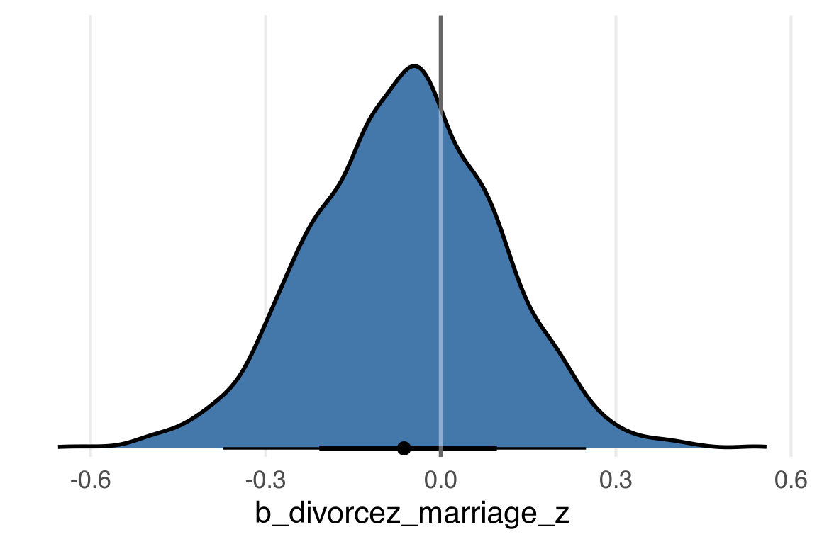
divorcez_age_z         -0.61      0.17    -0.94    -0.28 1.00     3753     3193
divorcez_marriage_z    -0.06      0.16    -0.38     0.24 1.00     3876     3235
marriagez_age_z        -0.70      0.10    -0.90    -0.48 1.00     5942     2618

Family Specific Parameters: 
                Estimate Est.Error l-95% CI u-95% CI Rhat Bulk_ESS Tail_ESS
sigma_divorcez      0.84      0.09     0.69     1.03 1.00     5746     2990
sigma_marriagez     0.72      0.08     0.59     0.89 1.00     6880     2852

Draws were sampled using sample(hmc). For each parameter, Bulk_ESS
and Tail_ESS are effective sample size measures, and Rhat is the potential
scale reduction factor on split chains (at convergence, Rhat = 1).

Marginalizing

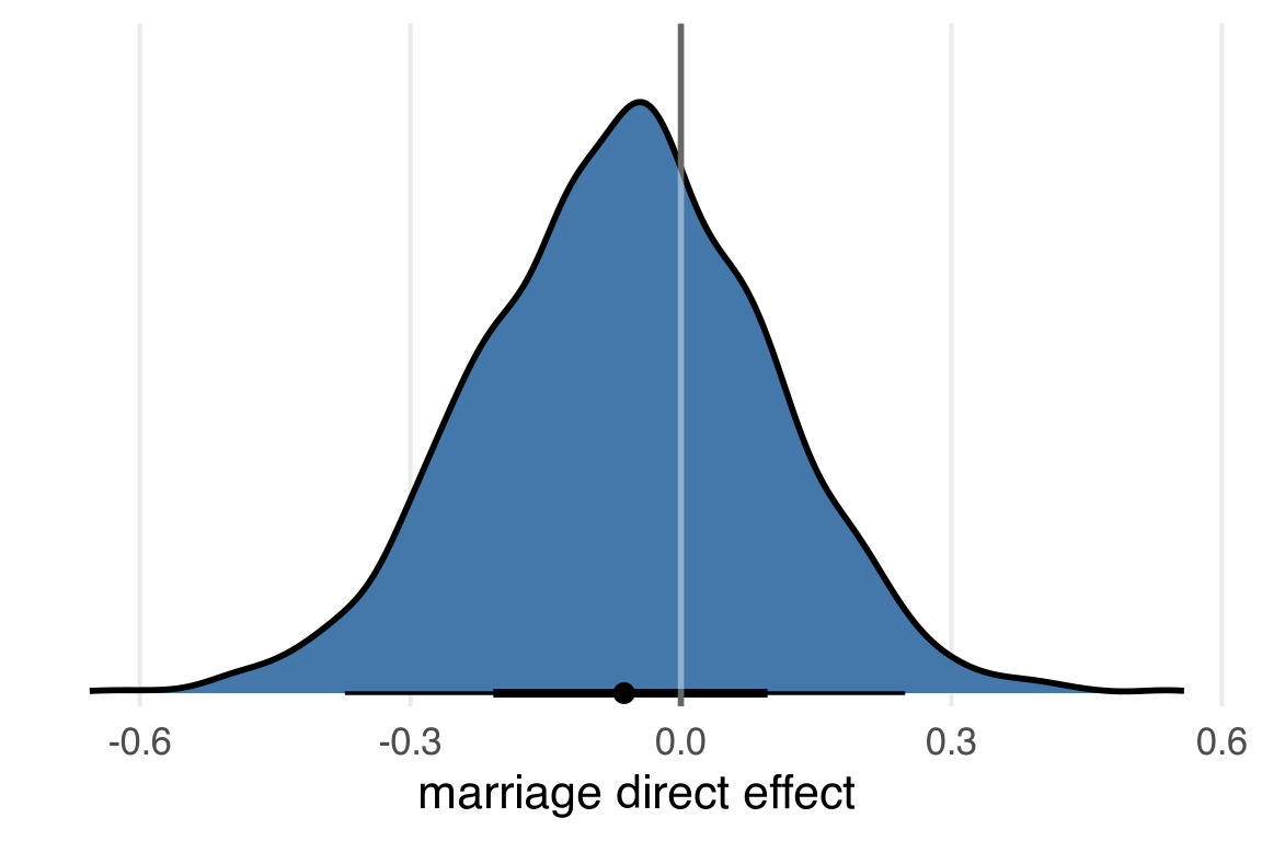
So, to “marginalize” over age, to get the direct effect of the marriage rate, I’d like to use the marginaleffects::slopes() function, but I think we’ve got a slight issue.

slopes(
  full_model
) |> 
  as_tibble() |> 
  filter(group == "divorcez") |> 
  count(term)
# A tibble: 1 × 2
  term      n
  <chr> <int>
1 age_z    50

Because marriage_z is also an outcome variable, it doesn’t want to give me its marginal slopes in the divorce_z outcome model. So much for full luxury bayes! But I can work around with predictions. I think what I want to use is grid_typ="counterfactual" in datagrid().

datagrid(
  model = full_model,
  marriage_z = c(0,1),
  grid_type = "counterfactual"
) |> 
  rmarkdown::paged_table()
predictions(
  full_model,
  newdata = datagrid(
    marriage_z = c(0,1),
    grid_type = "counterfactual"
  )
) |> 
  posterior_draws() |> 
  filter(group == "divorcez") ->
  divorce_pred

nrow(divorce_pred)
[1] 400000

Ok, this gives us 40,000 values, which is 20,000 for marriage_z == 0 and 20,000 for marriage_z == 1. And given that the original data had 50 rows, that’s back to the 4,000 posterior samples we got from the model.

head(divorce_pred) |> 
  rmarkdown::paged_table()

The draw column has the posterior draw, so what I want to do is pivot wider so there’s a column for marriage_z==0 and marriage_z==1, then subtract one from the other. I had some issues figuring out which columns need to get dropped for that to happen cleanly, but the answer is rowid and, I think, everything from estimate through conf.high

divorce_pred |> 
  select(
    -rowid,
    -(estimate:conf.high)
    ) |> 
  pivot_wider(
    names_from = marriage_z,
    values_from = draw
  ) |> 
  mutate(marriage_effect = `1`-`0`) |> 
  group_by(drawid) |> 
  summarise(
    avg_marriage_effect = mean(marriage_effect)
  ) ->
  avg_marriage_effect

As it turns out, every estimate of marriage_effect was the same within each draw, but this might not’ve been the case for a model with interactions, say.
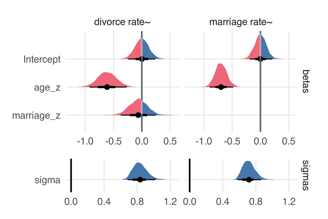
plotting code
avg_marriage_effect |> 
  ggplot(aes(avg_marriage_effect)) +
  list(
    stat_halfeye(
      point_interval = "mean_hdci",
      fill = ptol_blue,
      slab_color = "black"
    ),
    geom_vline(
      xintercept = 0,
      color = "grey40",
      linewidth = 1
    )) |> blend("screen")+
    scale_y_continuous(
      expand = expansion(mult = 0.02)
    )+
    labs(x = "marriage direct effect")+
    theme_no_y()

Figure 5: Marriage rate direct effect on divorce rate

I have a sneaking suspicion that for this case, this is identical to the estimate of the slope.

plotting code
full_model |> 
  spread_draws(
    b_divorcez_marriage_z
  ) |> 
  ggplot(aes(b_divorcez_marriage_z)) +
  list(
    stat_halfeye(
      point_interval = "mean_hdci",
      fill = ptol_blue,
      slab_color = "black"
    ),
    geom_vline(
      xintercept = 0,
      color = "grey40",
      linewidth = 1
    )) |> blend("screen")+
    scale_y_continuous(
      expand = expansion(mult = 0.02)
    )+
    theme_no_y()

Figure 6: Posterior slope of marriage rate on divorce rate

Lol, well.

One big plot

Let’s make one big plot of all the estimated effects. Not all of the parameters from the model are ones we’ll want

full_model |> 
  get_variables()
 [1] "b_divorcez_Intercept"  "b_marriagez_Intercept" "b_divorcez_age_z"     
 [4] "b_divorcez_marriage_z" "b_marriagez_age_z"     "sigma_divorcez"       
 [7] "sigma_marriagez"       "lprior"                "lp__"                 
[10] "accept_stat__"         "treedepth__"           "stepsize__"           
[13] "divergent__"           "n_leapfrog__"          "energy__"             

I’ll grab all the betas and the sigmas.

full_model |> 
  gather_draws(
    `b_.*`,
    `sigma_.*`,
    regex = T
  )->
  all_param_draws

I’ll want to facet the plots by whether we’re looking at draws for the marriage rate outcome or for the divorce rate outcome, so I’ll create some new columns.

all_param_draws |> 
  mutate(
    outcome = case_when(
      str_detect(.variable, "marriagez")~"marriage rate~",
      str_detect(.variable, "divorcez")~"divorce rate~"
    ),
    class = case_when(
      str_detect(.variable, "b_") ~ "betas",
      str_detect(.variable, "sigma") ~ "sigmas"
    )
  ) -> 
  all_param_draws

And now I’ll want a new cleaned up variable name for plotting.

all_param_draws |> 
  mutate(
    param = .variable |> 
      str_remove("b") |> 
      str_remove("_divorcez") |> 
      str_remove("_marriagez") |> 
      str_remove("^_")
  )->
  all_param_draws
plotting code
all_param_draws |> 
  mutate(
    param = factor(
      param,
      levels = rev(c(
        "Intercept", 
        "age_z", 
        "marriage_z", 
        "sigma"
        ))
    )
  ) |> 
  ggplot(aes(.value, param))+
    stat_halfeye(
      aes(
        fill = after_stat(x < 0)
      ),
      point_interval = "mean_hdci"
    )+
    scale_x_continuous(
      breaks = c(-1, 0, 1)
    )+
    labs(y = NULL,
         x = NULL)+
    facet_grid(
      class ~ outcome, 
      space = "free",
      scales = "free"
    )+
    theme(
      legend.position = "none"
    )

Figure 7: Posterior estimates of model parameters

One thing that’s maybe less than ideal is that the sigma parameters really aren’t on the same kind of scale here. Maybe they should be in a completely different plot, and put together with patchwork?

plotting code
all_param_draws |> 
  mutate(
    param = factor(
      param,
      levels = rev(c(
        "Intercept", 
        "age_z", 
        "marriage_z", 
        "sigma"
        ))
    )
  ) ->
  param_to_plot

param_to_plot |> 
  filter(class == "betas") |> 
  ggplot(aes(.value, param))+
  list(
    stat_halfeye(
      aes(
        fill = after_stat(x < 0)
      ),
      point_interval = "mean_hdci"
    ),
    geom_vline(
      xintercept = 0,
      color = "grey40",
      linewidth = 1
    )
  ) |> 
  blend("screen")+
    #scale_x_continuous(
    #  breaks = c(-1, 0, 1)
    #)+
    labs(y = NULL,
         x = NULL)+
    facet_grid(
      class ~ outcome
      #space = "free",
      #scales = "free"
    )+
    theme(
      legend.position = "none"
    )->
  betas

param_to_plot |> 
  filter(class == "sigmas") |> 
  ggplot(aes(.value, param))+
    stat_halfeye(
      aes(
        fill = after_stat(x < 0)
      ),
      point_interval = "mean_hdci"
    )+
    geom_vline(
      xintercept = 0,
      color = "black",
      linewidth = 1
    )+
    #scale_x_continuous(
    #  breaks = c(-1, 0, 1)
    #)+
    labs(y = NULL,
         x = NULL)+
    facet_grid(
      class ~ outcome, 
      #space = "free",
      #scales = "free"
    )+
    expand_limits(x = 0)+
    theme(
      legend.position = "none",
      strip.text.x = element_blank()
    ) -> 
  sigmas


layout <- "
A
A
A
B
"

betas + sigmas + plot_layout(design = layout)

Figure 8: Posterior estimates of model parameters

Hm, idk.