
Following on from my post about darkmode in ggplot2 4.0, I wanted to also mess around with the new stat_manual() that’s available. And folks, it’s good!
The announcement blog post says
You can provide [stat_manual()] any function that both ingests and returns a data frame. It can create new aesthetics or modify pre-existing aesthetics as long as eventually the geom part of the layer has their required aesthetics.
Let’s put it to the test!
Plotting sine waves
I’m teaching Phonetics this semester, so I’ve got sine waves on the mind. Over a single cycle, the amplitude of sine wave of \(h\) Hz can be given as
\[ y = \sin(2hx\pi) \]
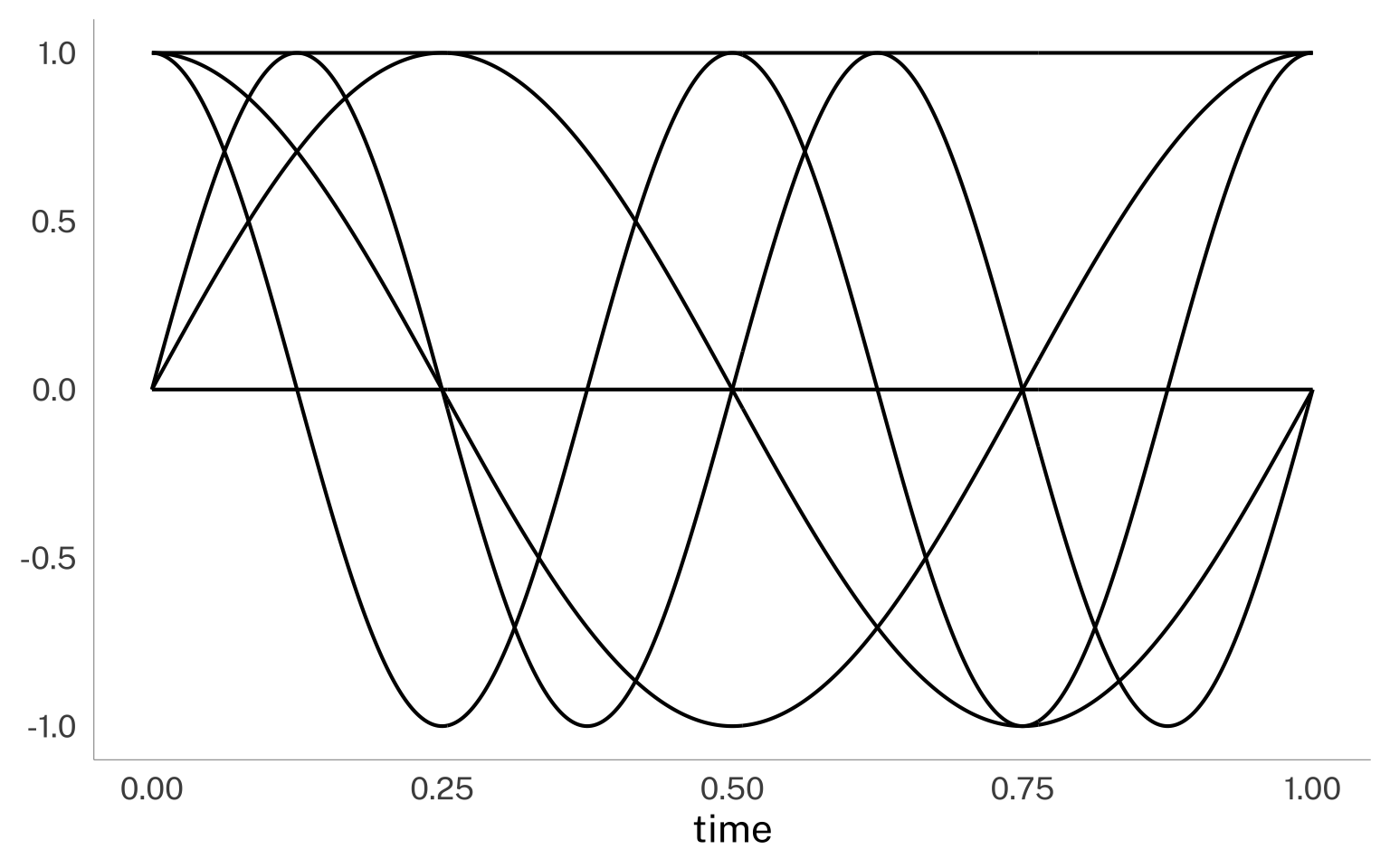
Let’s assume I’m going to pass a make_sine() function with an x and freq column.
freq isn’t a normal aesthetic, but if I map a data column to freq in the ggplot aesthetic mapping, it’ll get processed by the make_sine() function. I’ll set up a grid of values of time by frequency with expand_grid() and pass it to ggplot. I map time to the x-axis and frequency to the freq “aesthetic” that make_sine() will make use of.
The important part is in geom_line(), where I tell it to use the "manual" aesthetic with the make_sine() function.
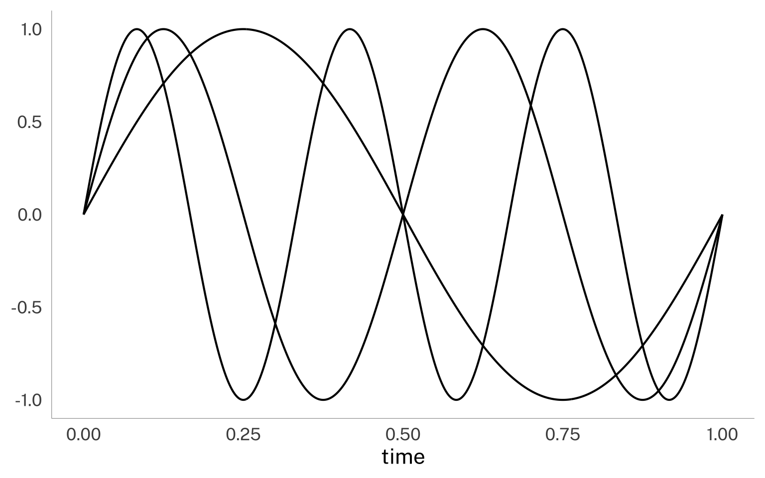
Voila! The make_sine() function calculated the y values! Another fun thing is I can map the values I passed to freq to another aesthetic with after_stat()
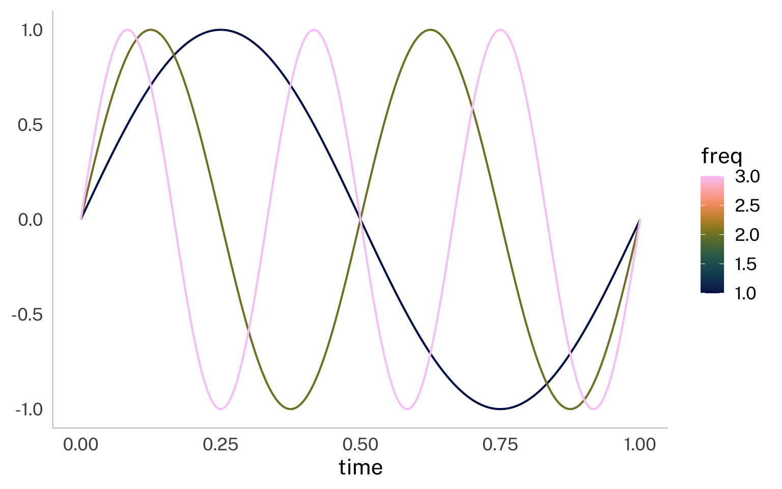
I wanted to see if I could plot some discrete Fourier transform basis functions too. For this, I have two copies of the input data frame bound row-wise to each other, one with the sine functions and the other with the cosine. To get the right groupings by line, I define the group aesthetic as well. I’ve also added in whether the function is sine or cosine.
The code here is basically the same as above, but I’ve swapped in make_dft.
And again, we can also map any data columns processed or created by our custom stat function to other aesthetics.
dft_plot +
aes(
color = after_stat(freq),
linetype = after_stat(func)
)
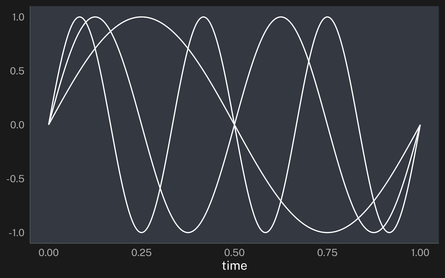
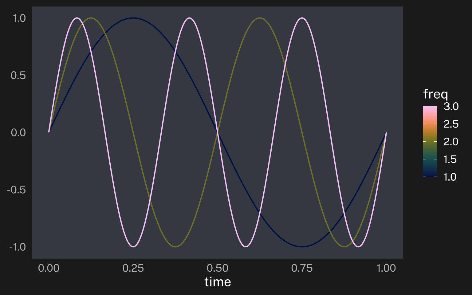
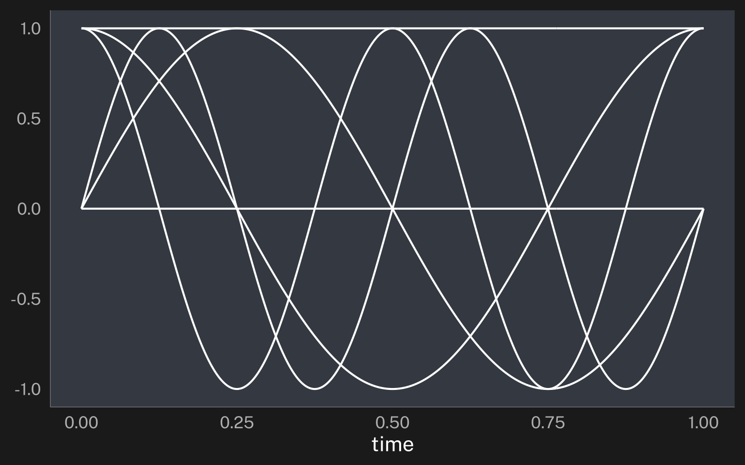
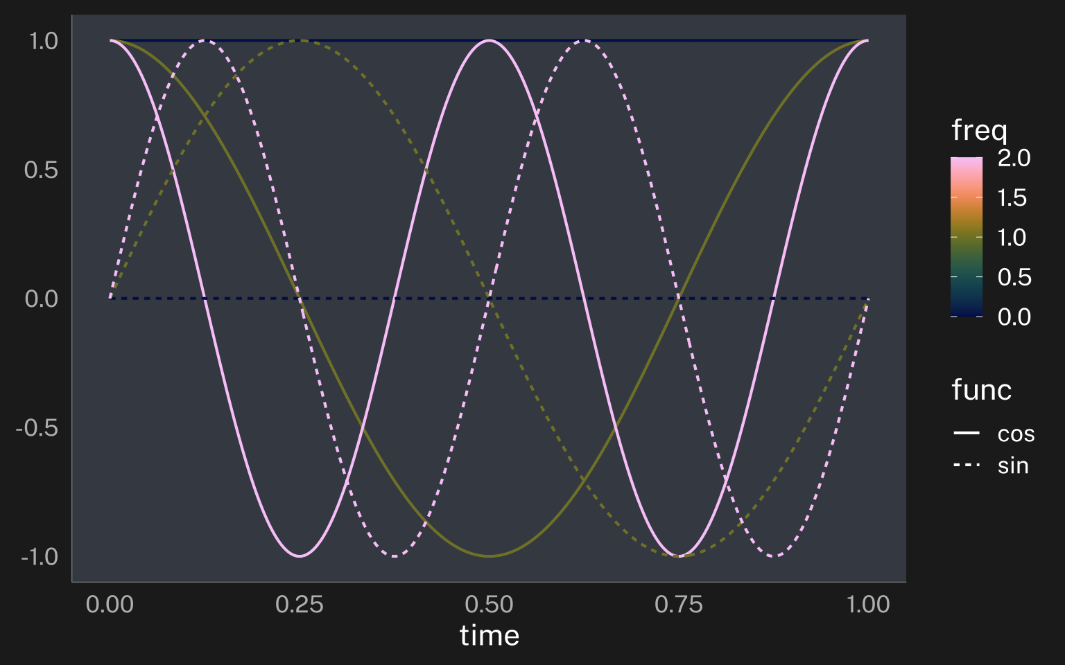
last_plot() + theme_darkmode()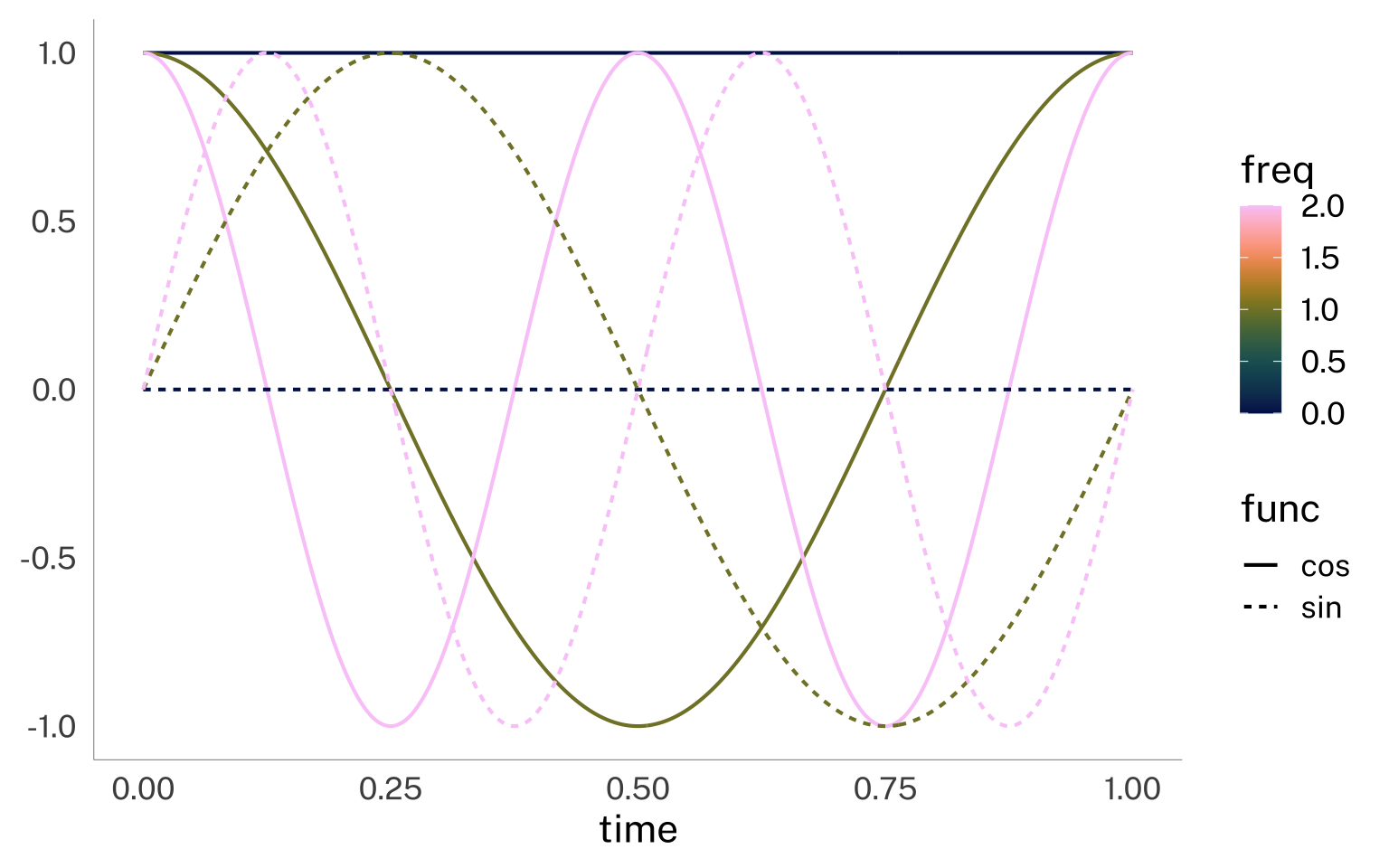
Multi-aggregation plots
I’m commonly in the situation of wanting to visualize data at multiple levels of aggregation on the same plot. For example: I might want a plot of by-speaker & by-vowel means, along with a point indicating by-speaker grand means. Previously, this has involved aggregating the data twice, then adding each aggregation to the plot.
speaker_data |>
  summarise(
    .by = c(speaker, vowel),
    across(F1:F2, mean)
  ) ->
  vowel_means

speaker_data |>
  summarise(
    .by = c(speaker),
    across(F1:F2, mean)
  ) ->
  speaker_means

ggplot(
  data = vowel_means,
  aes(F2, F1, color = speaker)
) +
  geom_text(
    aes(label = vowel)
  ) +
  geom_point(
    data = speaker_means,
    size = 3
  ) +
  scale_x_reverse() +
  scale_y_reverse()

last_plot() + theme_darkmode()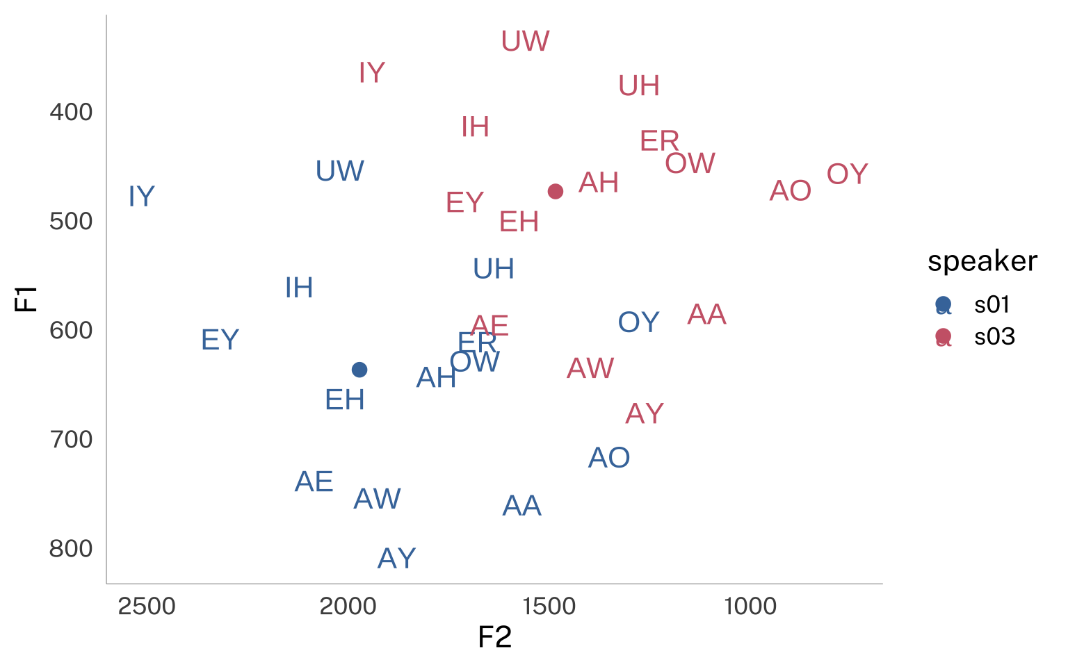

But with the right stat_manual() function, we can skip this initial aggregation step.
With make_means(), I’ve made sure to summarize input data grouped by all data columns that are not x or y. This will make sure that the aggregation will respect any aesthetic mapping we define in the plot.
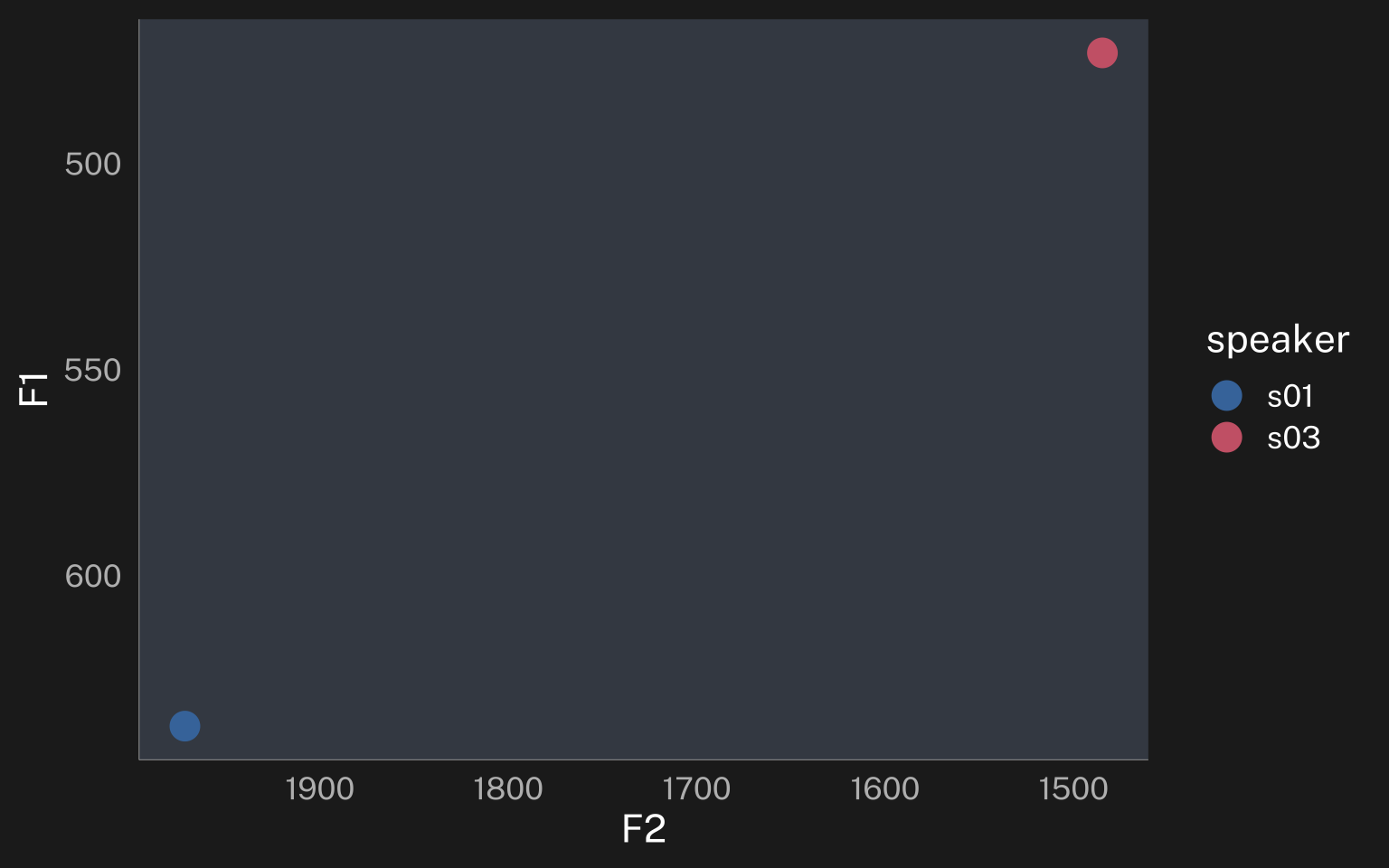
So, if we use this stat_manual() function without defining any other aesthetic mapping, we’ll get just one point in the middle of the plot at the mean of all x and y data.
speaker_data |>
  ggplot(
    aes(F2, F1)
  ) +
  geom_point(
    stat = "manual",
    fun = make_means,
    size = 5
  ) +
  scale_x_reverse() +
  scale_y_reverse()

last_plot() + theme_darkmode()
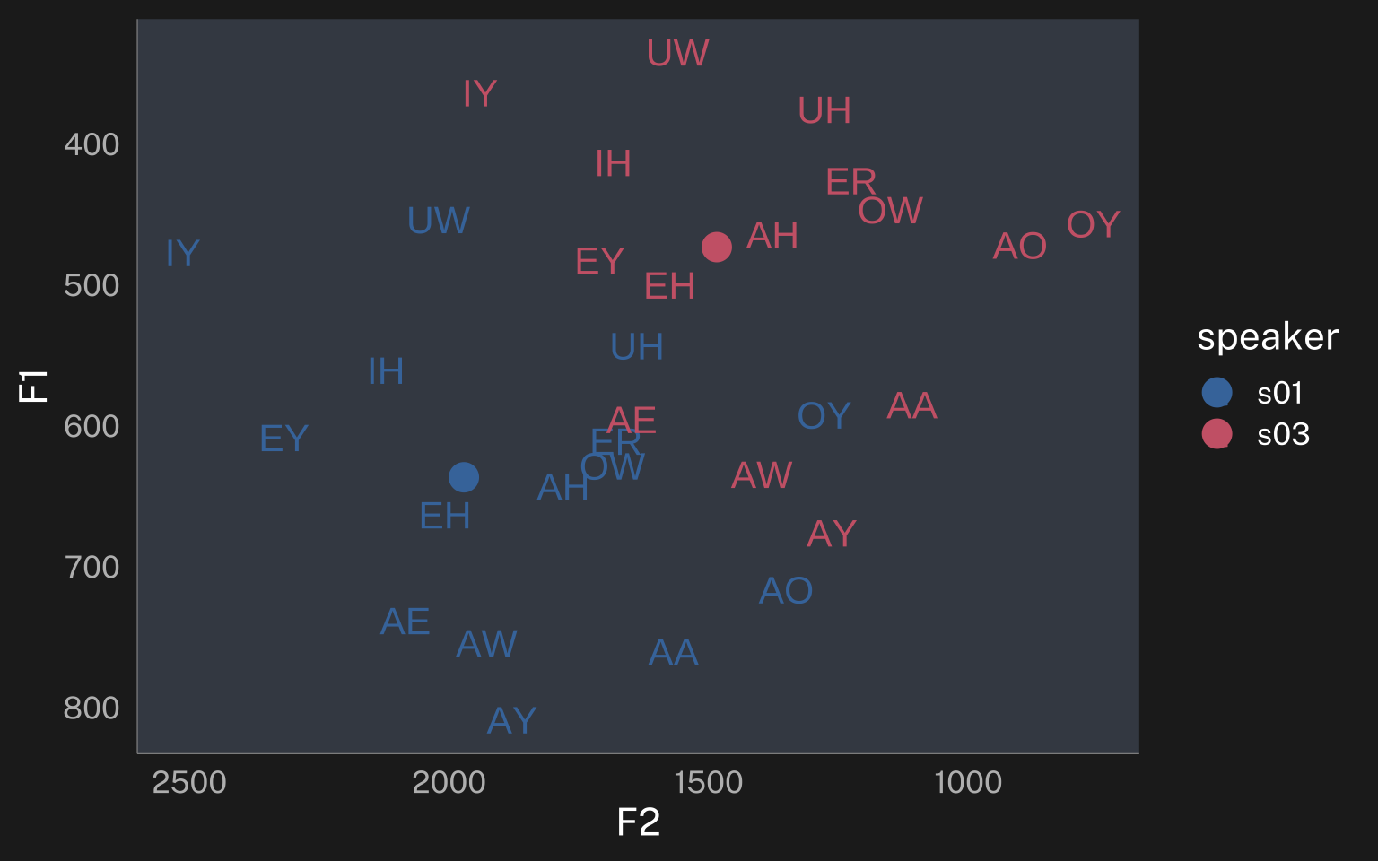
But if we map speaker to color, we’ll now get a point for each speaker
speaker_data |>
  ggplot(
    aes(F2, F1)
  ) +
  geom_point(
    aes(color = speaker),
    stat = "manual",
    fun = make_means,
    size = 5
  ) +
  scale_x_reverse() +
  scale_y_reverse()

last_plot() + theme_darkmode()
Getting the mean for each vowel just involves adding a geom_text() layer and mapping vowel to label.
speaker_data |>
  ggplot(
    aes(F2, F1)
  ) +
  geom_point(
    aes(color = speaker),
    stat = "manual",
    fun = make_means,
    size = 5
  ) +
  geom_text(
    aes(
      color = speaker,
      label = vowel
    ),
    stat = "manual",
    fun = make_means
  ) +
  scale_x_reverse() +
  scale_y_reverse()

last_plot() + theme_darkmode()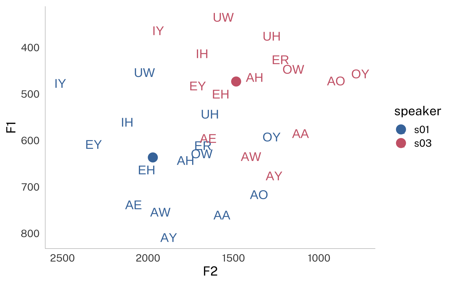
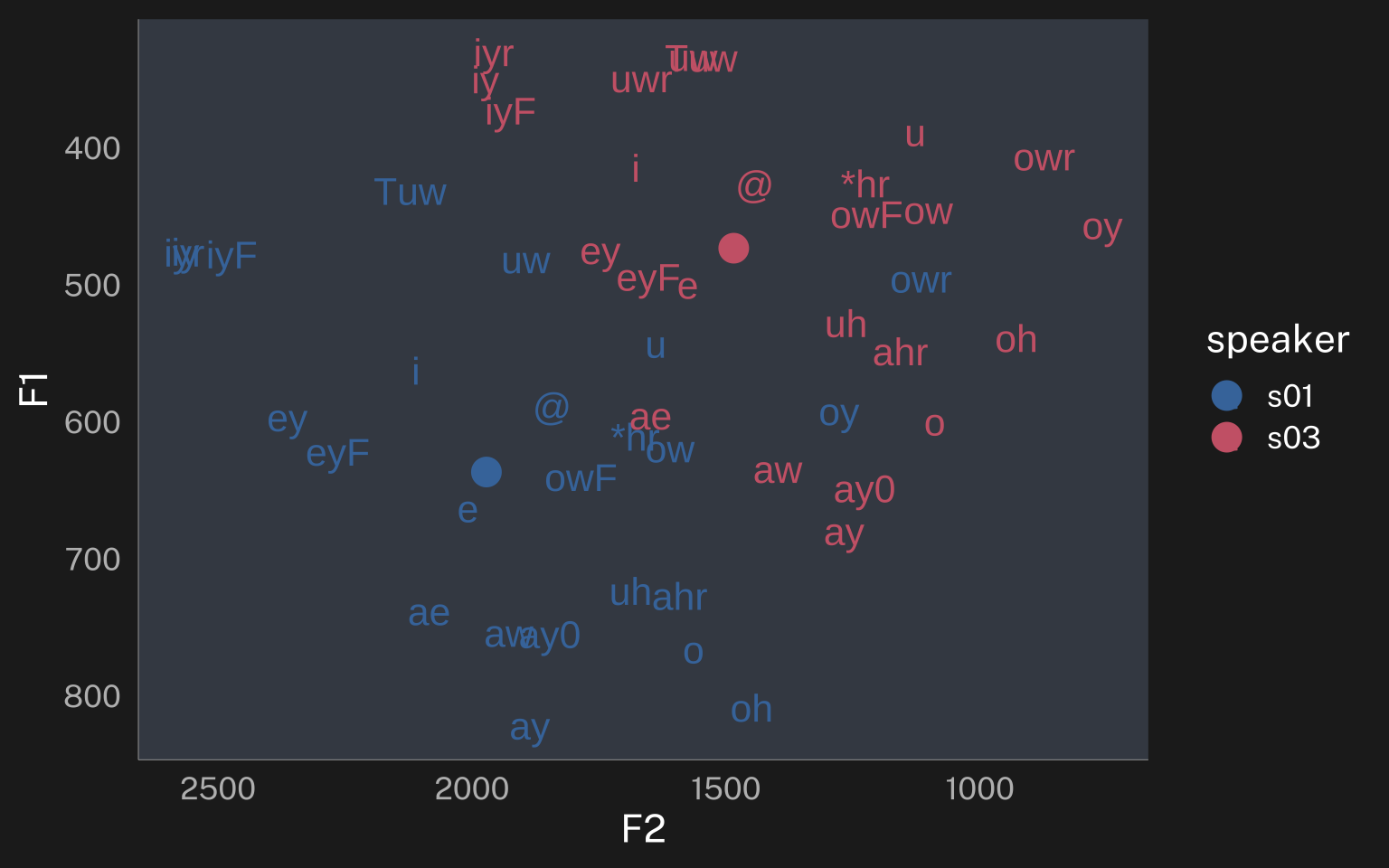
Boom! All of the data aggregation happened inside the ggplot processing! And what’s cool is I can change up my aesthetic mapping and the data will be re-aggregated correctly. There’s another vowel class coding in the plt_vclass column I can use instead by just mapping it to label
speaker_data |>
  ggplot(
    aes(F2, F1)
  ) +
  geom_point(
    aes(color = speaker),
    stat = "manual",
    fun = make_means,
    size = 5
  ) +
  geom_text(
    aes(
      color = speaker,
      label = plt_vclass
    ),
    stat = "manual",
    fun = make_means
  ) +
  scale_x_reverse() +
  scale_y_reverse()

last_plot() + theme_darkmode()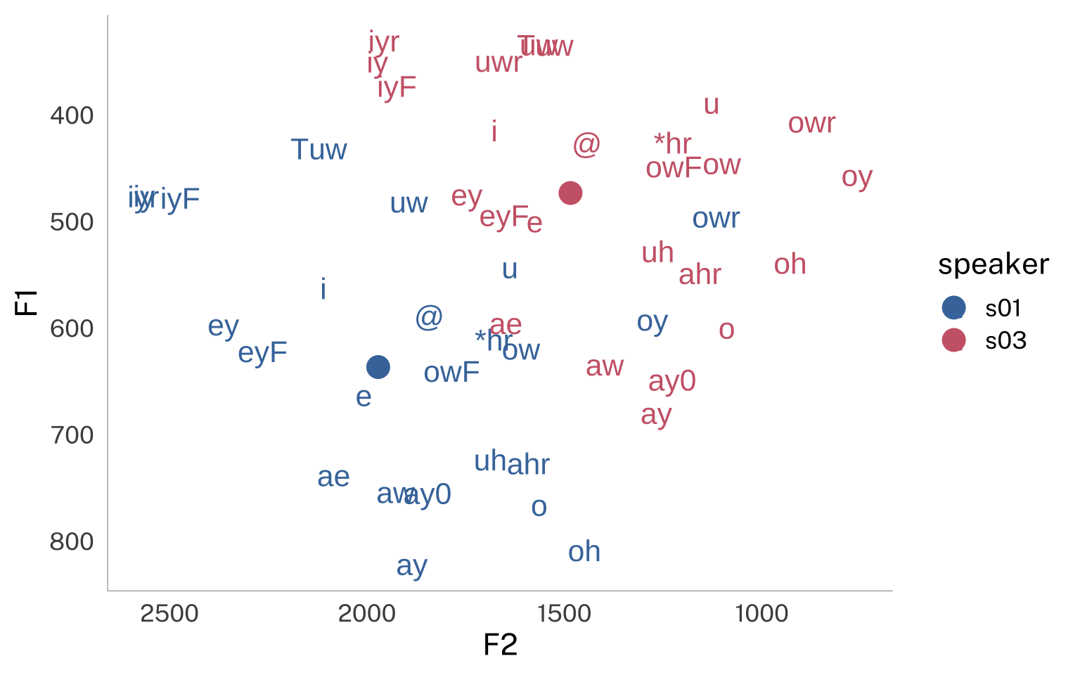
I’ll make a typical kind of plot you’ll see at a sociolinguistics conference. Let’s say I’m interested in whether or not the /o/ and /oh/ distributions overlap for these two speakers. I’ll want to plot the raw data, and maybe some data ellipses, and also a label in the center of each ellipse.
speaker_data |>
  filter(
    plt_vclass %in% c("o", "oh")
  ) |>
  ggplot(
    aes(
      F2, F1,
      color = speaker,
      shape = plt_vclass
    )
  ) +
  geom_point(alpha = 0.6) +
  stat_ellipse(aes(linetype = plt_vclass)) +
  geom_label(
    aes(
      label = plt_vclass,
      linetype = plt_vclass
    ),
    stat = "manual",
    fun = make_means,
    show.legend = F
  ) +
  scale_shape_manual(
    values = c(19, 1)
  ) +
  scale_y_reverse() +
  scale_x_reverse()

last_plot() + theme_darkmode()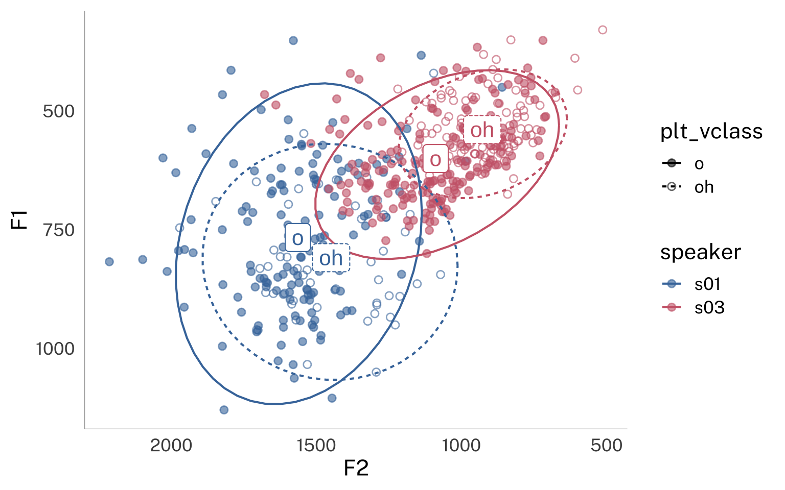
Sure, there’s a lot of ggplot in there, but I didn’t have to do any annoying additional aggregation to get the label positions!
Wrapping up
I foresee my ggplot life getting supercharged by this. For example:
speaker_data |>
  ggplot(
    aes(
      F2, F1,
      speaker = speaker,
      color = speaker
    )
  ) +
  geom_text(
    aes(label = ipa_vclass),
    stat = "manual",
    fun = \(df){df |> z_score() |> make_means()},
    family = "Voces",
    key_glyph = "rect"
   ) +
  scale_x_reverse() +
  scale_y_reverse()+
  coord_fixed()

last_plot() + theme_darkmode()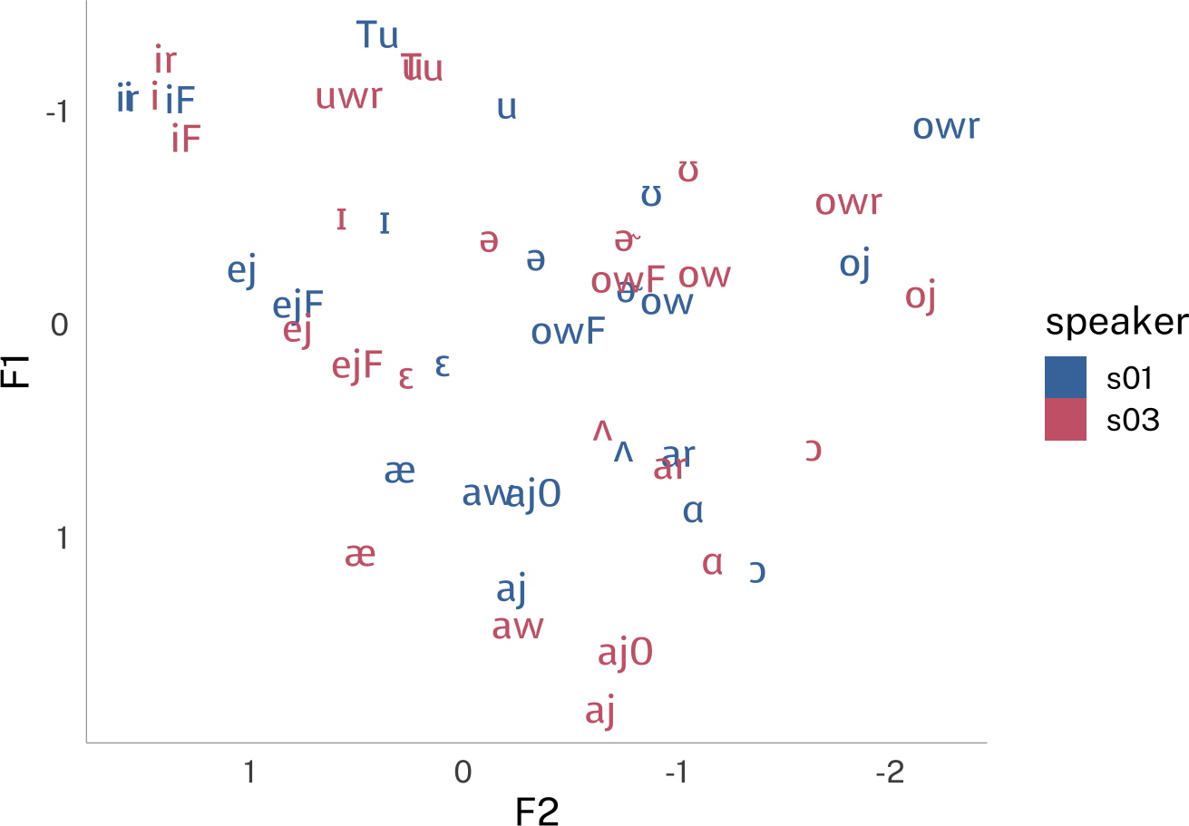
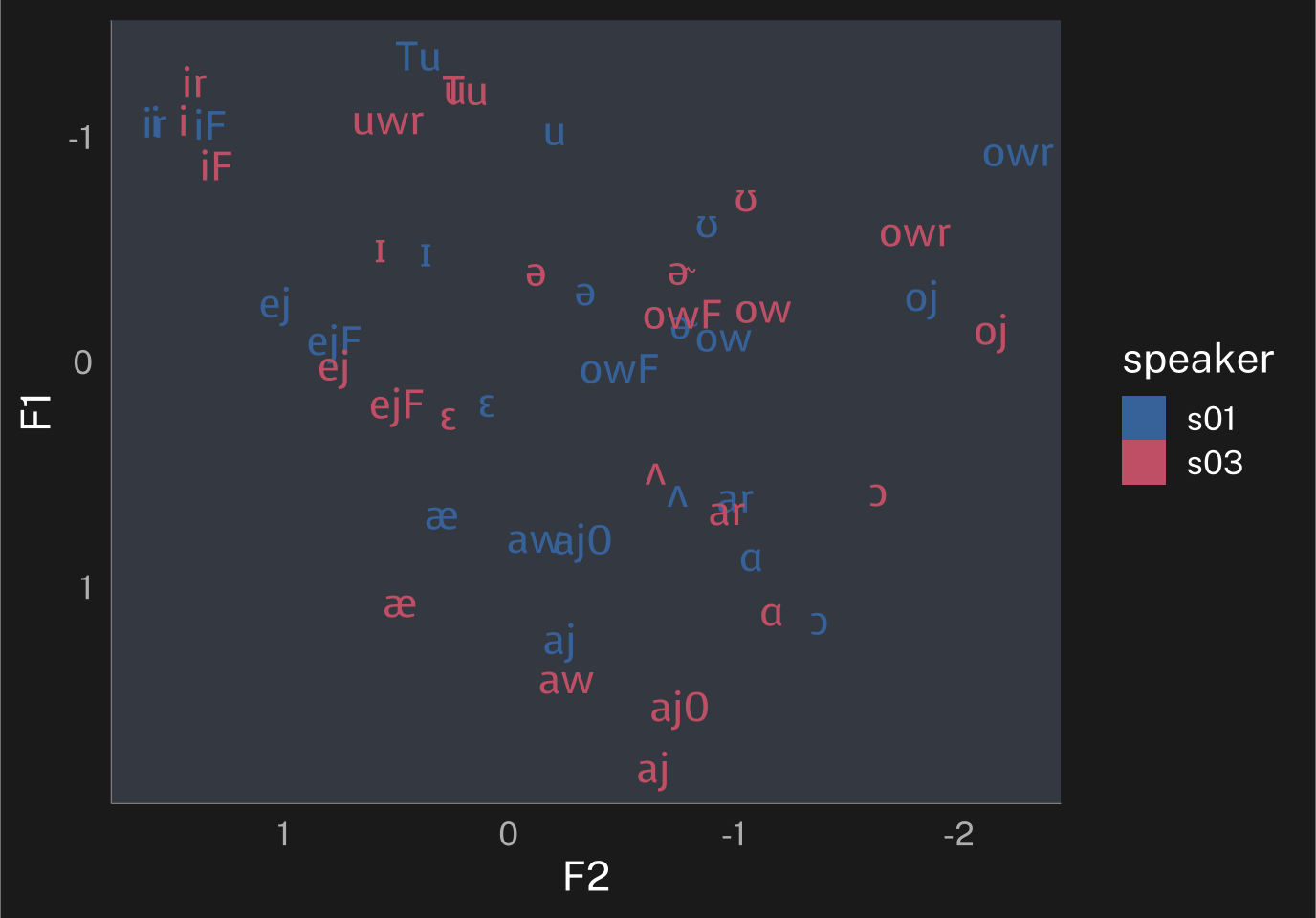
That’s Lobanov normalization done right there in ggplot!
Reuse
Citation
@online{fruehwald2025,
  author = {Fruehwald, Josef},
  title = {Working with Stat\_manual()},
  series = {Væl Space},
  date = {2025-09-12},
  url = {https://jofrhwld.github.io/blog/posts/2025/09/2025-09-12_working-with-stat-manual/},
  doi = {10.59350/yzh03-05k74},
  langid = {en}
}